Can I change how much the font sizes are reduced on mobile?
Yes, the default is to reduce the font sizes by a factor of 25% which can be changed in the Responsiveness Theme Settings.
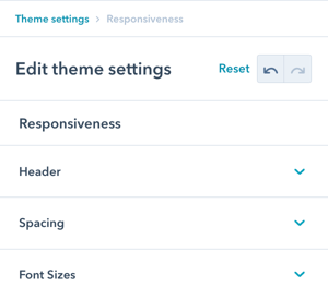
There are 3 sections in Theme Settings for Responsiveness: Header, Spacing, and Font Sizes.
Responsiveness
This design group provides options to modify the responsiveness configurations to further refine the UX on tablet and mobile.
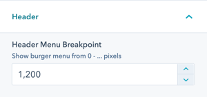
Responsiveness → Header
Adjust the breakpoint for where the menu switches to the burger menu for tablet/mobile.
If your header is using burger only, this doesn't apply.
Responsiveness → Spacing
Modify the horizontal padding and reduce spacing on mobile.
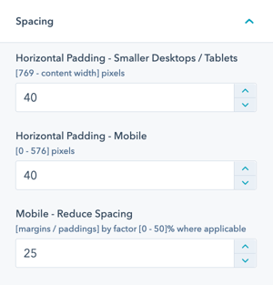
- Horizontal Padding: This controls the horizontal padding left and right of your content on smaller desktop and tablet devices as well as on mobile.
- Mobile – Reduce Spacing: All POWER modules reduce some of their paddings/margins for mobile devices. This factor controls how much those paddings/margins will be reduced by a percentage value.
Responsiveness → Font Sizes
Font sizes in POWER theme are designed to be responsive based on a percentage of the desktop size.
If you are using a very small font size on desktop, the minimum font size on mobile prevents it from becoming illegible.
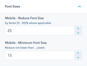
- Mobile – Reduce Font Size: All POWER modules reduce most of their font sizes for mobile devices. This factor controls how much those font sizes will be reduced by a percentage value.
- Mobile – Minimum Font Size: Here you can define the font size that should be used as the minimum value in case the reduction would lead to an even smaller value than this one.


_enhanced.jpg?width=300&name=pwr-entry__hero-bg-(1)_enhanced.jpg)


