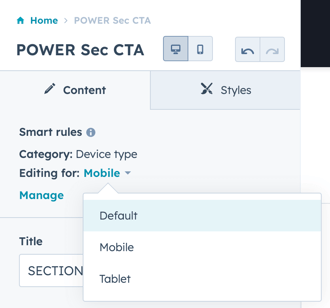
Use Smart Rules by device type to modify the content displayed on desktop, tablet, and mobile
Many modules include settings to configure alternate content for mobile or to modify the mobile experience, such as loading an alternate image background in Section Modules for desktop, tablet, and mobile or the option to Hide Mockup on Mobile in the Sec Device Mockup module.
Within the drag-and-drop editor, you can also adjust the padding for mobile.
When you need to further customize a module for mobile, there are two way you can do this:
- After creating the desktop layout, you can create an alternate layout for mobile and hide the desktop sections/modules on mobile and vice versa.
- Create a smart rule within the module to create a mobile variation of the same module
Smart Rules can be configured by Device Type for Desktop, Tablet, and Mobile, but you only need to create the smart rule for the device(s) you want to change, the remaining device would use the Default content.
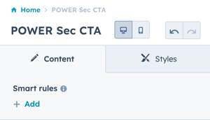
To start, you'll need to add a smart rule by clicking + Add at the top of the module editor:
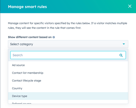
Then select Device Type from the dropdown:
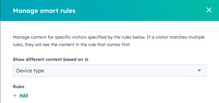
Then add each device type that you want to customize content for, any remaining device types will use the Default configuration:
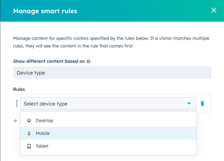
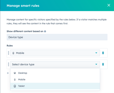
After you save the smart rules, you can edit the module for each rule:
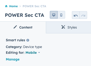
Click the link to change the device type you are editing for:
