- POWER Help Center - FAQs
- Modules
- Theme Modules
How do I fix my images so they are not cropped on smaller screens?
For Section Modules, you can load an alternate image for Mobile and Tablet
Some of the images used in the modules are configured as background images. This way, we can guarantee that the area which should be filled with the image, is always covered completely.
The downside of this method is that depending on the dimensions of the container element and the image itself, parts of the image can be cropped.
With Section Modules, you can configure a separate image for mobile and tablet.
You can also set the background position for the image which allows you to control where the focus of the image is, which becomes the new anchor point of the image when it is cropped for smaller screens.
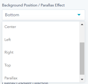
When a background image/video is selected, you will see an additional setting to control the anchor point for the image.

For example, if the focal point of your image is on the right, you could set the Background Position to "Right". Doing this would result in the left side of the image being cropped and retaining the focal point of your image on the right side.
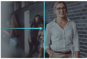
In this example, the focal point is the woman on the right.

By setting the background image to "Right" the image would be cropped on the left side to retain the focus on the right.