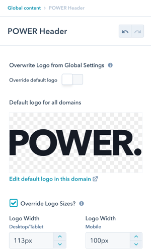
The default logo is from your domain brand kit, if it is not sized appropriately you can change the dimensions in the header
The global header allows you to change the logo dimensions, we recommend a width of 120px to fit best.

You can also override the default logo in the header settings if you need to use a different color or design for the header. How to update the logo in your HubSpot Settings.
Bigger isn't always better when it comes to the logo in your header or footer, sizing your logo too big uses valuable website real estate that can distract your site visitors from more important content, like your call-to-action.
The header is designed to limit the logo size from extending beyond the dedicated space in the header. This ensures all of the header elements fit comfortably and that your logo doesn't exceed a max width.
Wide Logo Designs
If your logo is wider than it is tall and it is not easy to read at 120px wide, you can add this code to your child.css and modify the width to better accommodate your logo design:
.pwr-header-logo {

max-width: 240px; /* increase this for wider logos */

}
For help modifying code, please submit a ticket and we'll be happy to help!
Tall or Square Logo Designs
If your logo is taller than it is wide or it is square and it is not easy to read at 120px wide, you can add this code to your child.css and modify the width to better accommodate your logo design:
.pwr-header--padding {

padding: 350px 0;

}
For help modifying code, please submit a ticket and we'll be happy to help!