Create CTAs in HubSpot
A simple button style CTA without personalization will have the least impact on your page performance.
The more complex your CTA is configured (e.g. personalization by device type) or if you're using images in your CTAs or if your page has multiple CTAs, you could see an increase in page speed due to the extra code that has to load.
Make sure your CTA images are optimized.
To reduce image file sizes without losing quality, use TinyPNG to compress your images (JPG, PNG, WebP).
Only use CTAs where you are actively tracking conversion paths, otherwise, we recommend using Buttons that can be styled to match CTAs.
What is the difference between a CTA and a Button?
The CTA setting allows you to select a Button CTA that contains the HubSpot tracking code and a Button allows you to configure a link that looks like a button.
When creating CTAs for POWER theme, the styles will be applied automatically by the theme or module settings, so you won't need to create the style in the CTA Editor.
Create CTAs for Your HubSpot Website Pages
Marketing → CTAs
To create a new CTA, click Create CTA and complete the steps.

IMPORTANT: In order to use a CTA with the POWER CTA modules, your CTA must be created as an "Embedded HTML" CTA Type.
Marketing → CTAs → Start from Scratch
Choose "Start from scratch" within the left menu and then choose "Embedded HTML" under the advanced options.

Within your HTML CTA editor, you can set your button content and link to the element you wish to have your CTA link to.

Then navigate to the Advanced view and insert the text pwr-cta_button into the field Custom CSS Classes. This lets the theme take care of the styling of this CTA.
Please note: Any additional text or CTA styling configured via the editor will overwrite your POWER CTA styles.

HubSpot Knowledge Base create CTAs in HubSpot
Helpful Links: Settings for Theme Styles
CTA Styles for POWER Theme
Theme Settings → Colors → POWER → CTAs
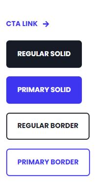
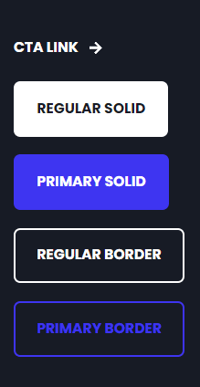
The global CTA styles can be configured in the Theme Settings, which will then be applied to all pages using your POWER child theme.
There are 5 default styles for Light Scheme and 5 default styles for Dark Scheme.
Light Background
Dark Background
Theme Settings → Styling → Buttons → Custom Styles
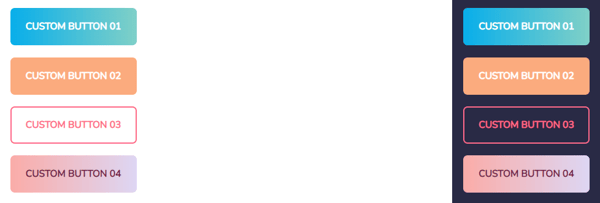
You also have the option to design 4 unique custom buttons that are available throughout the POWER modules.
You can customize the text color, background, and border for the default and hover state for each button.
Content → Website Pages
Within the POWER modules, you will find a CTA selector in the module configurations.

In the style section of the module configurations, you will find different options to adapt the appearance of the CTA button.
CTA → CTA Style
Choose from the preconfigured CTA styles, including the 4 custom button styles.
CTA → CTA Size
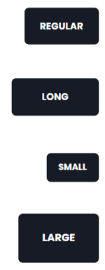
Within POWER modules with CTA capabilities, you can also modify the size of the CTA with your choice of Regular, Long, Small or Large.
How to Use CTAs in Rich Text Editors
CTAs can be placed in any of the Rich Text Editors available in any of the modules.
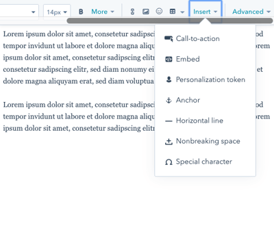
The default style is the Primary Background configuration for all POWER modules. If you would like to use a different CTA style, we recommend adding the Mini CTA module to easily add a styled CTA to your page.
How to Use Buttons in Rich Text Editors
If you would like to use other CTA/button styles within POWER modules, you'll need to configure them as a button (not a CTA).
To do this, open the Rich Text Editor and choose Advanced > Source Code
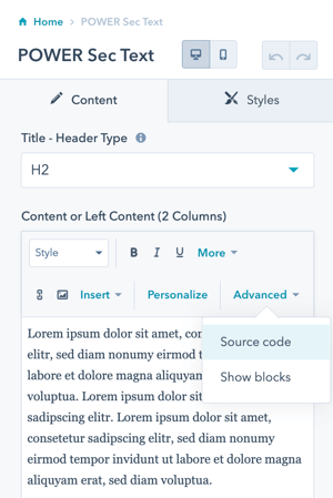
Copy and Paste this code where you would like the button to be, replacing the URL and button text with your link information.
You can use the list below to change the style of the button within the code by changing the div class in the code provided.
Button Style → CSS Class
Solid Primary → pwr-cta--primary-solid
Solid Regular → pwr-cta--regular-solid
Primary Border → pwr-cta--primary-border
Regular Border → pwr-cta--regular-border
Primary Background → pwr-cta--regular-solid-primary-background
Link → pwr-cta--link
Custom Button 01 → pwr-cta--custom-01
Custom Button 02 → pwr-cta--custom-02
Custom Button 03 → pwr-cta--custom-03
Custom Button 04 → pwr-cta--custom-04
You can also modify the div class further to adjust the button size, by adding one of these after the class above separated only with a space (default size is regular):
Long → pwr-cta--long
Small → pwr-cta--small
Large → pwr-cta--large


_enhanced.jpg?width=300&name=pwr-entry__hero-bg-(1)_enhanced.jpg)


