Website Shape Dividers
How to create shape dividers for sections on your website pages
Adding shape dividers does not have an impact on how quickly the page loads, they are created with very small SVG files that are optimized and are loaded asynchronously.
Pages without shape dividers will not load any additional JS files.
Depending on layering and position on page, may have an impact on mobile devices due to the additional files that have to be loaded.
Because they are SVG files, your shape dividers will be fully responsive on all screen sizes and resolutions, including retina displays.
If multiple shape dividers are on the same page or complex layering of shapes for a section, we recommend that you disable on mobile (can disable on mobile for basic shapes as well to reduce impact overall).
Which modules have shape dividers?
Shape dividers can only be added to POWER Sec modules, with a few exceptions, and the Footer.
Shape Dividers are designed to enhance your website layout by adding textural elements to the horizontal sections on the page, helping to blur the edges of sections of content to create a smooth transition as the user scrolls down the page.
Add Shape Dividers to Your HubSpot Website Theme
Content → Website Pages → [POWER SEC Module] → Style → Shape Divider
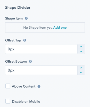
Style → Shape Divider → Shape Item
This is where you will add the shapes to build your Shape Divider, you can add as many as you would like.
The first item in this list will be in the back (bottom layer). The last item in this list will be visible in the front (top layer).
Style → Shape Divider → Offset Top and Offset Bottom
The shape grows into the content area for the section. The offset adds space between the shape and the content area so you can control whether the shape overlaps the content (above or below can also be determined).
Style → Shape Divider → Above Content
If true, this hides the content if the shape overlaps it.
Style → Shape Divider → Disable on Mobile
Option to disable shape dividers on mobile to reduce the load time for the page (shape and JS files don't have to be loaded).
Style → Shape Divider → Shape Item → Add one
Click this link to add your first shape.
Style → Shape Divider → Shape Item → Diagonal
The default shape is Diagonal and will be the name of the Item until you change the shape.
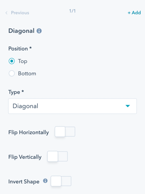
Style → Shape Divider → Shape Item → Diagonal → Position
Option for the shape divider to be at the Top of the Section or the Bottom of the Section.
Style → Shape Divider → Shape Item → Diagonal → Type
Select the Shape you would like to use:
- Arrow Book
- Arrow Split
- Arrow Split Alt.
- Arrow Straight
- Corner Cut
- Corner Rounded
- Curve
- Round
- Diagonal
- Diagonal Rounded
- Triangle
- Triangle Asym.
- Triangle Asym. Alt
- Triangle Mini
- Paper Cut 1
- Paper Cut 2
- Paper Cut 3
- Wave 1
- Wave 2
- Wave 3
- Wave 4
- Wave Mini
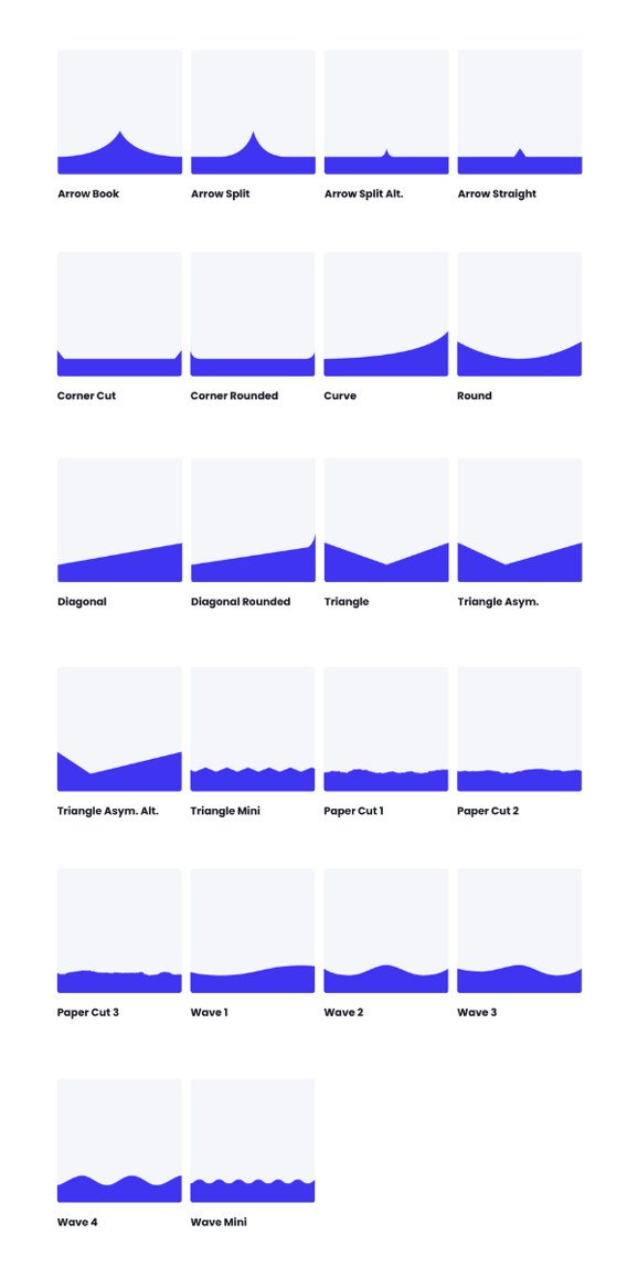
Style → Shape Divider → Shape Item → Diagonal → Flip Horizontally
Option to flip the shape on the y-axis to flip the left side of the shape to the right side of the shape.
Style → Shape Divider → Shape Item → Diagonal → Flip Vertically
Option to flip the shape on the x-axis to flip the top of the shape to the bottom of the shape.
Style → Shape Divider → Shape Item → Diagonal → Invert Shape
Fill the other area of the shape with color, creating the inverse shape from what is shown.
Style → Shape Divider → Shape Item → Diagonal → Transform Style
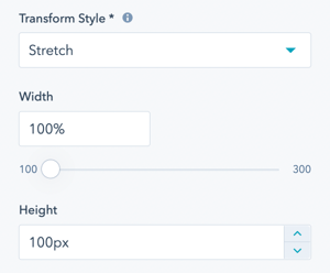
Choice of Stretch or Scale Ratio.
Scale Ratio will respect the width to height ratio of the original shape; the height will change depending on the device's width. Stretch will stretch the shape to fit your width and height settings; the height will stay the same across devices.
Style → Shape Divider → Shape Item → Diagonal → Width
Adjust from 100% to 300% of the original shape's width.
Style → Shape Divider → Shape Item → Diagonal → Height
Available for Stretch Transform Style only; set the height in pixels.
Style → Shape Divider → Shape Item → Diagonal → Color Type
Choice of Color or Gradient.
Style → Shape Divider → Shape Item → Diagonal → Color Type → Color
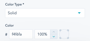
Style → Shape Divider → Shape Item → Diagonal → Color Type → Gradient
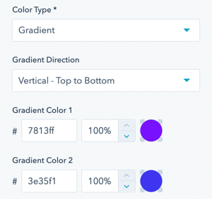
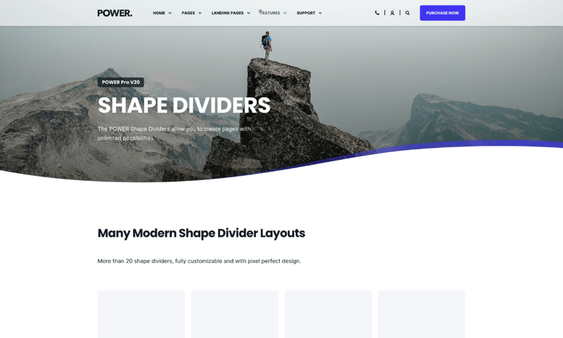
Shape Divider > Shape Item
- Wave 1
- Wave 1
Shape Divider > Offset Top / Offset Bottom
0px
1. Wave 1> Position
Bottom
1. Wave 1> Type
Wave 1
1. Wave 1> Flip Horizontally
Active
1. Wave 1> Transform Style
Stretch
1. Wave 1> Width
100%
1. Wave 1> Height
140px
1. Wave 1> Color Type
Gradient
1. Wave 1> Gradient Direction
Select an option (default)
1. Wave 1> Gradient Color 1
#3e35f1 at 70%
1. Wave 1> Gradient Color 2
#3e35f1 at 0%
2. Wave 1> Position
Bottom
2. Wave 1> Type
Wave 1
2. Wave 1> Flip Horizontally
Active
2. Wave 1> Transform Style
Stretch
2. Wave 1> Width
100%
2. Wave 1> Height
120px
2. Wave 1> Color Type
Solid
2. Wave 1> Color
#FFFFFF at 100%
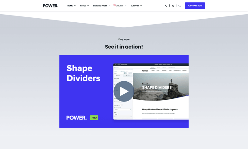
Shape Divider > Shape Item
- Triangle
Shape Divider > Offset Top
0px
Shape Divider > Offset Bottom
40px
1. Triangle> Position
Bottom
1. Triangle> Type
Triangle
1. Triangle> Transform Style
Stretch
1. Triangle> Width
100%
1. Triangle> Height
100px
1. Triangle> Color Type
Solid
1. Triangle> Color
#ccd1d9 at 100%
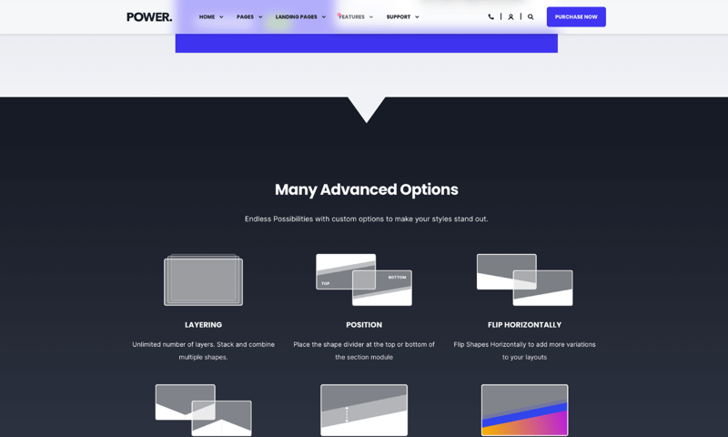
Shape Divider > Shape Item
- Arrow Straight
Shape Divider > Offset Top
0px
Shape Divider > Offset Bottom
-50px
1. Arrow Straight> Position
Bottom
1. Arrow Straight> Type
Arrow Straight
1. Arrow Straight> Transform Style
Scale Ratio
1. Arrow Straight> Width
100%
1. Arrow Straight> Color Type
Solid
1. Arrow Straight> Color
#171b25 at 100%

Shape Divider > Shape Item
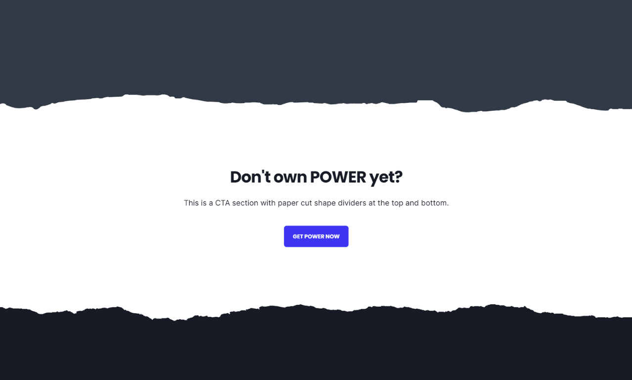
- Paper Cut 3
- Paper Cut
Shape Divider > Offset Top
80px
Shape Divider > Offset Bottom
80px
1. Paper Cut 3> Position
Top
1. Paper Cut 3> Type
Paper Cut 3
1. Paper Cut 3> Transform Style
Scale Ratio
1. Paper Cut 3> Width
100%
1. Paper Cut 3> Color Type
Solid
1. Paper Cut 3> Color
#323947 at 100%
2. Paper Cut> Position
Bottom
2. Paper Cut> Type
Paper Cut
2. Paper Cut> Transform Style
Scale Ratio
2. Paper Cut> Width
100%
2. Paper Cut> Color Type
Solid
2. Paper Cut> Color
#171b25 at 100%


_enhanced.jpg?width=300&name=pwr-entry__hero-bg-(1)_enhanced.jpg)


