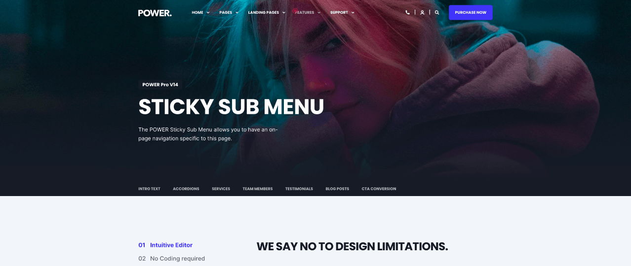
Sticky Sub-Menu Module
How to configure the Sticky Sub-Menu module for POWER theme in HubSpot
Can I create a menu that sticks to the top of an individual page?
The Sticky Sub-Menu is designed for on-page navigation and allows you to set anchor links on the page.
Links
This is where you will add the links for the sub-menu.

One Link is added by default and can be modified by clicking the Edit icon when you hover over the item. Additional links can be added by cloning the existing item or clicking +Add.
Links > Link Text
For each Link item, you can configure the Link Text.
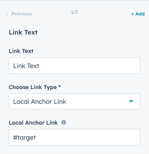
Links > Choose Link Type
Choice of Local Anchor Link or External Link.
A Local Anchor Link is used to jump the user down the page to a specific section on the page, help with anchor links.
Links > Local Anchor Link
Add the anchor link text that you've configured (or plan to use here), make sure to include the hashtag (#) at the beginning like this: #target
Links > External Link > URL
If using an External Link, add the URL to the page you want to link to.
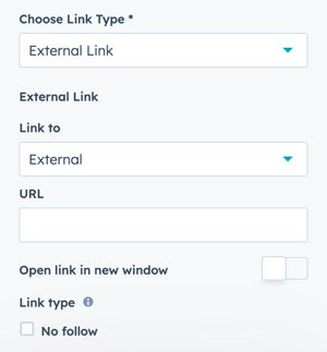
Option to Open link in new window and set as "No follow"
Layout
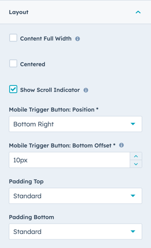
Layout > Content Full Width
Check the box to span the menu links across the whole width of the screen.
Otherwise, the menu links will be limited to the width of the content.
The background of the menu can span the full width of the section without setting the links to the full width by following the steps to configure the Section Alignment and Spacing.
Layout > Centered
Check the box to center the links in the module.
Layout > Show Scroll Indicator
Check the box to show how far the user has scrolled on the page.
The Scroll Indicator isn't configured to align with the Link Text, it is based on the position of the cursor on the page. The Scroll Indicator is based on a calculation that measures the position of the cursor on the page relative to the total length of the page. If you have a very long page it is possible that the scroll indicator will pass the link for the section.
Layout > Mobile Trigger Button: Position
Choice of Bottom Right or Bottom Left.
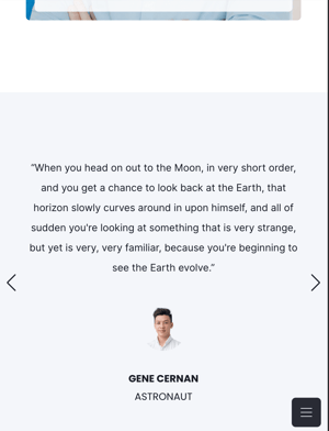
On Mobile, the Sticky Sub Menu creates a button on the bottom of the page using a burger menu icon.
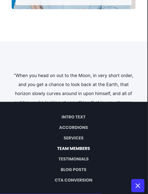
When the user clicks the Mobile Trigger Button, the Sub-Menu expands from the bottom of the screen.
Steps to hide the module on mobile if you want it on desktop only.
Layout > Mobile Trigger Button: Bottom Offset
Option to set the distance from the bottom of the screen for the button to display. The default is 10px.
Layout > Padding & Margin Top and Bottom
Choice of Standard, None, Small, Medium, Large, or First Section with Header. Refer to your theme settings for these for more information on this sizing.
Style → Color Scheme
Choice of Light or Dark.
Tip: If you change the background color for the module, the definition of Light Color scheme is a light background with dark text and Dark Color scheme is a dark background with light text. Based on your background color, you would need to toggle the color scheme to ensure the text color displays properly and is legible.
Style → Overwrite Link Color
Leave blank to inherit the Link Color from your theme settings.
Define the Link Color by the color hex code or use HubSpot’s color picker.
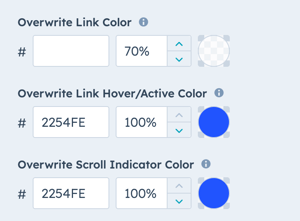
Style → Overwrite Link Hover/Active Color
Leave blank to use the standard value (inherited from your theme settings).
Style → Overwrite Scroll Indicator Color
Leave blank to use the standard value (inherited from your theme settings).
Style → Font Size Desktop
Set the font size for the links on desktop.
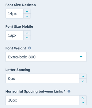
Style → Font Size Mobile
Set the font size for the links on mobile.
Style → Font Weight
Set the font weight to use for the links. Make sure that the font weight you select in the module is one that you have included in your theme settings.
If you choose a font weight that is not included in your theme settings, it will fall back to the next available font weight.
Style → Letter Spacing
Option to adjust the spacing between the letters.
Style → Horizontal Spacing between Links
Defines the left and right margin of the links, the default is 30px.
Style → Show Box Shadow
Adds a box shadow at the bottom of the sticky bar (adds visual depth to the design).
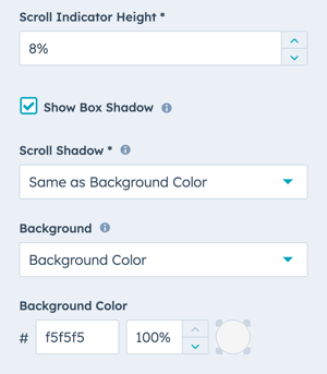
Style → Scroll Shadow
Choice of None or Same as Background Color
If you add more links than fit across the page, this setting will add a shadow to indicate to the user that they can scroll.
Style → Background
Choice of Background Color, Background Image/Video, Background Gradient, or Transparent. Refer to Settings that apply to all Section Modules for more details about these choices.
Visbility
Choose to hide your module on specific screen sizes. For more information see common module information.
Accessibility
Set aria labels for elements within your module to ensure compatibility with screen readers if required.

Section → Alignment and Spacing
Full Width
Layout → Content Full Widht
Not Checked
Style → Color Scheme
Dark
Style → Horizontal Spacing between Links
16px
Style → Scroll Indicator Height
100%

Section → Alignment and Spacing
Full Width
Layout → Content Full Widht
Not Checked
Style → Color Scheme
Dark
Style → Horizontal Spacing between Links
20px
Style → Scroll Indicator Height
100%
DESIGN SOMETHING COOL WITH THIS POWER MODULE?
Share it with us!- MODULE OVERVIEW
- SEC Accordion
- SEC Breadcrumbs
- Coming Soon
- SEC CTA
- SEC Form
- SEC Images
- SEC Map
- SEC Post Preview
- SEC Simple Listing
- SEC Stats Counter
- SEC Steps
- SEC Timeline
- Sticky Sub-Menu
- SUB Accordion
- SUB Stats Counter
- SUB Steps
- Mini CTA
- Mini Icon
- Mini Tag
- Previous Next Navigation
- Page Settings
- HS Heading
- HS Divider
- HS Rich Text
- Back to Module Library


_enhanced.jpg?width=300&name=pwr-entry__hero-bg-(1)_enhanced.jpg)


