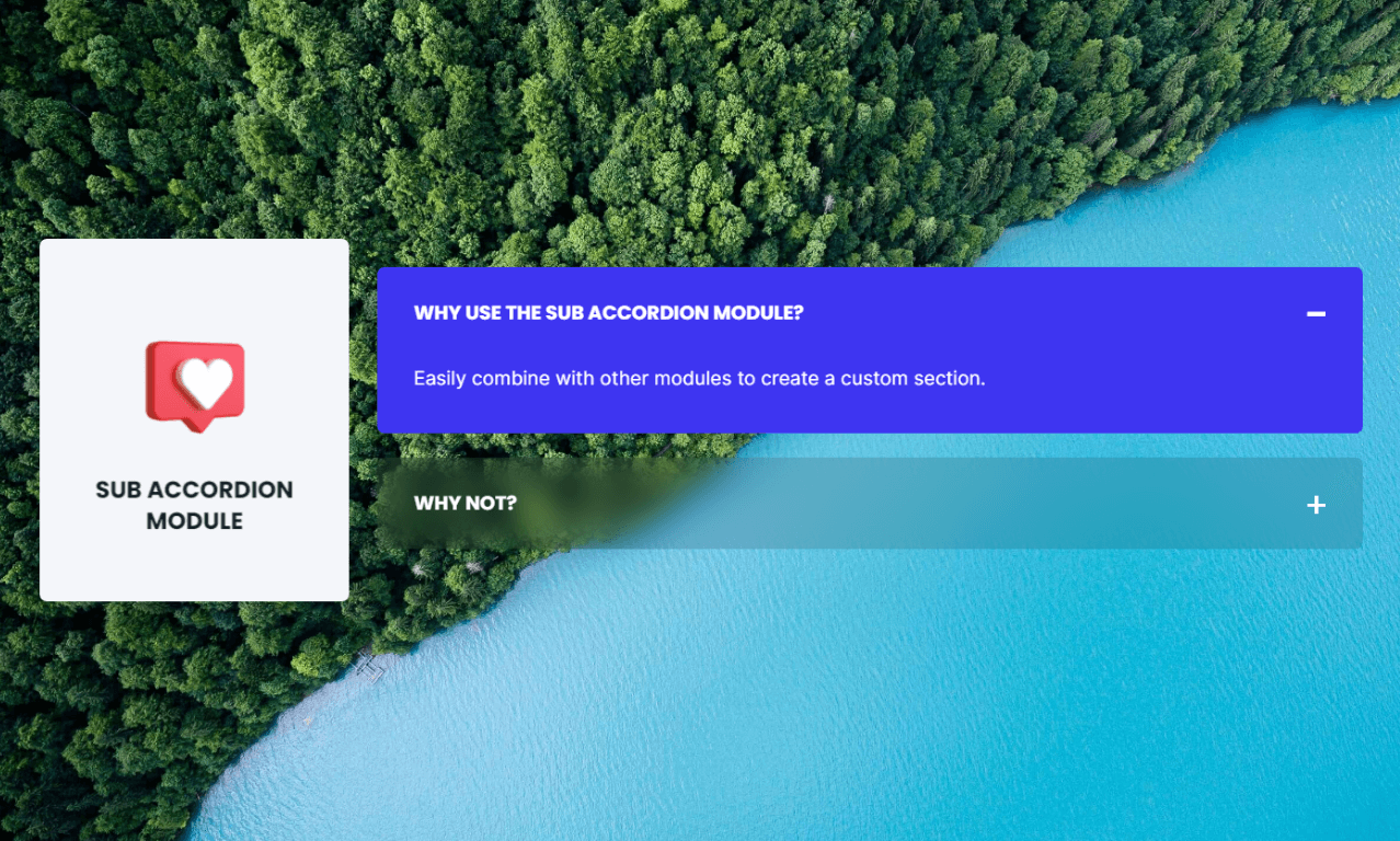
POWER Sub Accordion Module
How to configure the Sub Accordion module for POWER Pro theme in HubSpot
Very minimal impact to page load speed, the code for this module has been optimized to limit resources needed on page load.
Can increase page load speed on mobile if used above the fold.
Additional impact on desktop and mobile if images are added to the rich-text editor without lazy loading and/or compression.
An image or video background also impacts page performance.
Convert images to WebP where possible to meet criteria to serve images in next-gen format.
To reduce image file sizes without losing quality, use TinyPNG to compress your images (JPG, PNG, WebP).
Vector images (SVG) also help keep file sizes to a minimum and can be used for graphics like logos and icons.
What's the difference between Sec Accordion and Sub Accordion modules?
The Sec Accordion module is a fully configured section and the Sub Accordion module is the basic accordion functionality to build custom sections.
Accordion
This is where you will add the items that appear in the accordion.

When you hover over the preset item, you will see two icons appear for actions you can take: edit and clone.
Additionally, there is a + Add link above the first item where additional items can be added.
Tip: Depending on the complexity of the "answers" to your FAQ, it could be better to create the first item and then use the clone function to retain the formatting vs. using the +Add to create a set number of default items. If you have fairly simple Q&A without a lot of formatting, there is also a + Add link within the item settings to easily add additional items one after the other.
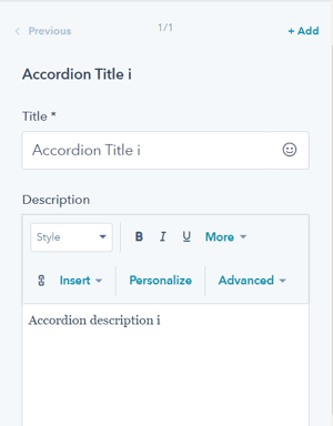
Accordion Item(s) → Title
This is where the Question goes if FAQ, otherwise, this is where the title/text goes that you want to display when the item is collapsed. This is a required field because it is used as the name of the item within the module, it can't be blank.
Accordion Item(s) → Description
This is where the Answer goes if FAQ, otherwise, this is where the text goes that you want to display when the item is expanded. The description uses a rich-text editor so you can format the answer as you'd like.
Accordion Item(s) → Open by default
By default, all items will be collapsed. If you want the item (or items) to be expanded on page load, you can check this box.

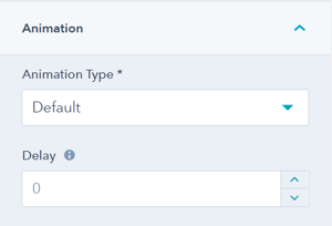
Accordion Item(s) → Animation
You can also override the default animation settings at the item level.
Style → Select Variant
This setting allows you to choose how you'd like the items in the accordion to look. The choices are Text Only, Boxed, Boxed Border, or Boxed Glassmorphism.
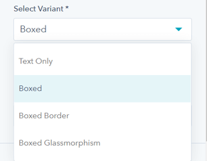
Check out the Configurations below to see how each of these variants can be styled.
Style → Color Scheme
Choice of Light or Dark.
Tip: If you change the background color for the module, the definition of Light Color scheme is a light background with dark text and Dark Color scheme is a dark background with light text. Based on your background color, you would need to toggle the color scheme to ensure the text color displays properly and is legible.
Style → Custom Box Background Color
Additionally, you can select a custom color for the item background when collapsed to use in place of the theme default.
The background color of the item on hover can only be set at the global level in the Theme Settings → Color → POWER → Boxed Elements.
Animation
Checkbox to turn on/off Animate on Scroll. Turning off here will only apply to this module, to turn animation off globally refer to Theme Options for Animations.
Visbility
Choose to hide your module on specific screen sizes. For more information see common module information.
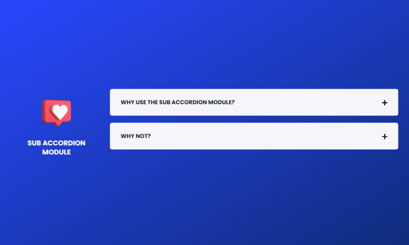
Style → Select Variant
Boxed
Section → Background
Gradient Background
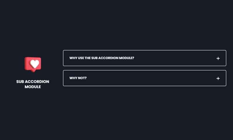
Style → Select Variant
Boxed Border
Style → Color Scheme
Dark
Section → Background
Color Background
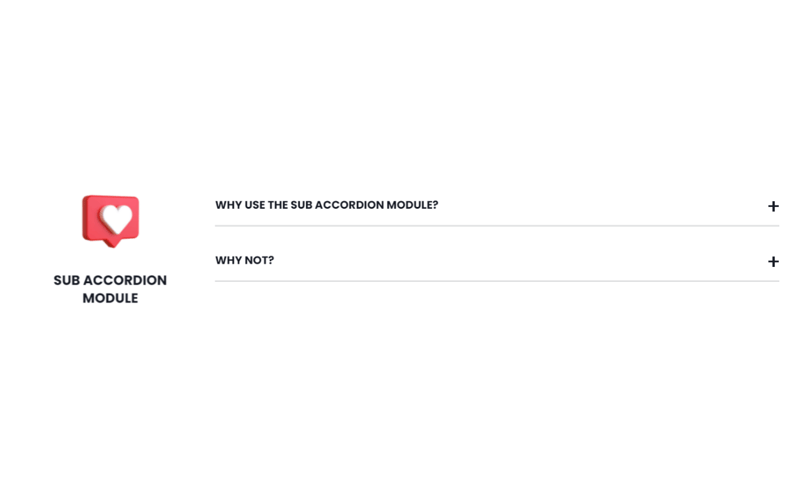
Style → Select Variant
Text Only

Style → Select Variant
Boxed Glassmorphism
Section → Background
Image Background
DESIGN SOMETHING COOL WITH THIS POWER MODULE?
Share it with us!- MODULE OVERVIEW
- SEC Accordion
- SEC Breadcrumbs
- Coming Soon
- SEC CTA
- SEC Form
- SEC Images
- SEC Map
- SEC Post Preview
- SEC Simple Listing
- SEC Stats Counter
- SEC Steps
- SEC Timeline
- Sticky Sub-Menu
- SUB Accordion
- SUB Stats Counter
- SUB Steps
- Mini CTA
- Mini Icon
- Mini Tag
- Previous Next Navigation
- Page Settings
- HS Heading
- HS Divider
- HS Rich Text
- Back to Module Library


_enhanced.jpg?width=300&name=pwr-entry__hero-bg-(1)_enhanced.jpg)


