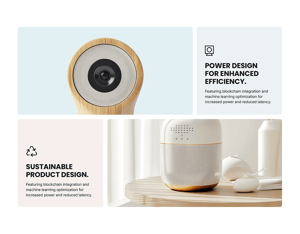
BENTO GRID MODULE
How to configure the Bento Grid module with advanced content
The Bento Grid Module itself will not have a significant impact on page speed. However, when used towards or in the viewport it may cause some content layout shifts (CLS).
The content contained within your Bento Grid Module may affect your page speed. Large images and videos will affect load times. Elements like CTAs and Menus will also require additional HubSpot scripts to be loaded.
An image background can also impact page performance.
Convert images to WebP where possible to meet criteria to serve images in next-gen format.
To reduce image file sizes without losing quality, use TinyPNG to compress your images (JPG, PNG, WebP).
Vector images (SVG) also help keep file sizes to a minimum and can be used for graphics like logos and icons.
We recommend reviewing our full performance guide here to fully optimize your POWER theme for speed.
What is the Bento Grid Module used for?
The Bento Grid Module adds an even greater layer of customization and functionality to your web pages. Allowing you to mix & match various content types in a unified design. Think of it as an Advanced Mega Menu for your page content.
Need help getting started?
To help make things easier for you to get started with our Bento Module, we have created 9 section templates using this module. Find out how to add section templates to your HubSpot CMS pages here.
Intro to Title
The smaller text above the title; can be left blank to hide on the page.
Title
The main heading for the section; can be left blank to hide on the page.
Title - Header Type
Choice of H1, H2, H3, or H4. This is how Google will determine the heading type. This does not control the formatting of the font, there is a separate setting under Style → Title Size to determine how the heading will display.
Description
You can add any amount of body text here or it can be left blank to hide on the page.
Layout of your Bento Grid Module
The layout of the Bento Grid Module is based on a 12-column grid, this allows for the most flexible layout to work with a variety of content elements and design layouts.
If you're not familiar with a 12-column grid in design, imagine 12 columns in a spreadsheet and you get to pick how many of those columns should be included in each of the content columns.

For example, if you want your content to have 2 columns, you could divide the 12 columns out to have 3 and 9, 4 and 8, 6 and 6, 8 and 4, or 9 and 3. These numbers form the width of the two columns where your content will go.
Within each column, you can create groups of content within a wrapper. The wrapper allows you to apply style and layout settings to unify the contents and create rows within the columns. You can have multiple contents in a wrapper, and multiple wrappers in a column.
Components of the Bento Grid Module
Use these links to jump to the corresponding configuration settings below.
Bento Grid Module = The overall structure of your module contained within the HubSpot CMS. This determines the placement of this content on your CMS page.
Wrapper(s) = a grouping of content within a column. Your wrappers will contain your content and determine how your content is split across your module.
Content(s) = choice of content type to be added to the wrapper; at least 1 per wrapper. Each piece of content will be contained within your wrapper and can consist of multiple different content types (such as icons, images, text, etc.).
Column(s) = the main structure of the Bento Grid Module; The amount of columns a module can display is based on the device window size. The module will be 12 columns wide on large desktops, 9 on smaller desktops, 6 on tablets, and 3 on mobile by default. The width of your content within your columns is dependent on your settings and if you have "Auto Fill Gaps" enabled.
Choosing your Bento Grid Module Layout
Use these links to jump to the corresponding style settings below.
Bento Grid Module Style = overall style of the Bento Grid Module, the background here is the furthest layer back
Wrapper Style = style settings for individual wrappers within a column, this layer is on top of the Column and all content within the wrapper sits on top of the wrapper styles
Bento Grid Module → Layout
The layout menu will allow you to configure the overall layout of your content module and how your wrappers will be displayed within the columns.
Bento Grid Module → Layout → Columns
This section will allow you to set how many columns your module will have within different screen sizes. You can set specific columns for Desktop, Small Desktop, Tablet, and Mobile. For more information about the column layout see the layout section.
Bento Grid Module → Layout → Auto Fill Gaps
If this is activated, the last piece of content in your column or row will fill the rest of the blank space within your module.
Bento Grid Module → Layout → Grid Gaps
This sets the horizontal spacing between each of your content elements.
Bento Grid Module → Layout → Width of Content
Choice of Content Width or Full Width.
If set to full width, the module spans the whole window width. If set to content width, the module spans only the content area width.
Bento Grid Module → Layout → Padding & Margin Top and Bottom
Choice of Standard, None, Small, Medium, Large, or First Section with Header. Refer to your theme settings for these for more information on this sizing.
Bento Grid Module → Layout → Margin Top & Bottom
This will set the margin at the top and bottom of your module.
Bento Grid Module → Layout → Show More
Enabling this option will allow you to hide your content behind a "show more" button depending on the size of your content.

Bento Grid Module → Layout → Show More Options
Within these options the "collapsed height" is the height of your module that you wish to set as the initially displayed section of your content. Any content that is above this collapsed height will be hidden initially behind your "show more" button. Within here you can set the initial height for your content within Desktop, Tablet and Mobile screen widths.
You can also customise your button style based on the standard theme button styles, or use any of your custom button styles.
Module Style Settings
Bento Grid Module → Style
Here you can set the style settings for your Bento Grid Module.

Bento Grid Module → Style → Color Scheme.
Here you can set the color scheme for your module. Color schemes are defined within your theme settings.
Bento Grid Module → Style → Title Styles - Text
If set to default your title style will inherit your theme settings default title styles. Here you can choose to also overwrite the default with a specific color or gradient.
Bento Grid Module → Style → Title Style - Background
Here you can set a specific color or gradient as the background of your module title.
Bento Grid Module → Style → Title Styles/Sizes
Within these options, you can set a style, background, and size (h1, h2, h3 etc) for each of your titles.
Bento Grid Module → Style → Section Box Shadow
Here you can set a box shadow around your module to create a sense of visual depth.
Bento Grid Module → Style → Wrapper Border Radius
Here you can set curved borders (border radius) on each of your wrappers. The checkbox will allow you to enable this and the field below this will allow you to set how curved this will be. The higher the pixel number the more curved these corners will be. Additionally, this can be controlled on the wrapper level per wrapper.
Bento Grid Module → Style → Wrapper Box Shadow
This will set a box shadow for your wrappers. Additionally, this can be controlled on the wrapper level per wrapper.
Bento Grid Module → Style → Background
Here you can set a background color, image, video, or gradient for your module.
Configuring a Wrapper
Bento Grid Module → Wrapper(s)
A wrapper is how you will group items within the column and allow you to apply additional styling. You can create multiple wrappers per column to separate content, but you will need at least one wrapper to add content to the column.
Wrappers will be placed next to each other until the row is filled respecting your column layout. New rows are created automatically.
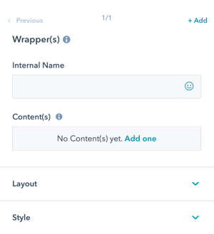
Bento Grid Module → Wrapper(s) → Internal Name
If left blank the Internal Name will default to "Wrapper(s) 1, and continue in sequential order for each wrapper in the column.
We recommend adding a name for your sanity.
Bento Grid Module → Wrapper(s) → Link
This will set a link covering the entire wrapper section of your module. Any content placed inside this wrapper will link to this content. IMPORTANT: If a link is placed in this section, individual content links will break the layout. Links inside of links are not allowed due to HTML specifications.
You can choose to link to an external URL, HubSpot Content, files, Email addresses, Phone numbers, a HubSpot Pop-up CTA, or a HubSpot Blog post. You can also set your link to open in a new window and include a no-follow tag if required for SEO.
If you wish to use an anchor link to link to a section on the same page, you can enter your anchor tag in the "Use Internal URL instead" section.
Bento Grid Module → Wrapper(s) → Layout
Here you can set your Column and Row sizing and alignment for your wrapper.

Bento Grid Module → Wrapper(s) → Layout → Column Span
The Column Span will determine how many columns your wrapper will span. This can range from 2-12 columns. A desktop module will display up to 12 columns, Tablet will display 9 and a Mobile will display 3 columns in width by default. The column layout is based on a 12-column grid. Below you can see some examples of column configurations.
Bento Grid Module → Wrapper(s) → Layout → Row Span
The row span will determine the vertical space this wrapper will take up within your layout. The number of rows is influenced by the chosen grid and the number of wrappers. This only takes effect in layouts with multiple rows.

Bento Grid Module → Wrapper(s) → Layout → Custom Height
Here you can override the Row height for this wrapper and set a custom height for this wrapper. Please be aware that this can create empty spaces in your layout. Try to use Row Span as much as possible and only set a static height where it is needed, e.g. for wrappers that have a background image without content and span the whole width.
Bento Grid Module → Wrapper(s) → Layout → Alignment Horizontal/Vertical
Choice of Left, Center, or Right for horizontal or Top, Middle or Bottom for vertical.
This is how you would like the content to align within the wrapper.
Wrapper Style Settings
Bento Grid Module → Wrapper(s) → Style
The style settings for the Wrapper apply to the entirety of the wrapper; each wrapper can be styled independently otherwise the style settings from the Column will be inherited.
Wrapper styles are layered on top of the Column styles, which are layered on top of Bento Grid Module Style.

Bento Grid Module → Wrapper(s) → Style → Color Scheme
Choice of Light, Dark, or Inherit.
Tip: If you change the background color for the module, the definition of Light Color scheme is a light background with dark text and Dark Color scheme is a dark background with light text. Based on your background color, you would need to toggle the color scheme to ensure the text color displays properly and is legible.
Bento Grid Module → Wrapper(s) → Style → Add inner padding?
This will add padding inside of the wrapper, this will not cause your wrapper to take up more space in your module but will add padding inside of the wrapper. If this is checked you will see 2 fields to set your padding top & bottom and left & right.
Bento Grid Module → Wrapper(s) → Style → Wrapper Border Radius
Choice of inherit, true or false. If set to inherit this will inherit your border radius from the main module's settings. If set to true you can set a specific border radius for this wrapper. You can use false to disable the border radius on this specific wrapper.
Bento Grid Module → Wrapper(s) → Style → Wrapper Box Shadow
Choice of inherit, true or false. If set to inherit this will inherit the box shadow from the main module's settings. If set to true you can set a specific box shadow for this wrapper. You can use false to disable all box shadows on this specific wrapper.
Bento Grid Module → Wrapper(s) → Style → Background
Choice of Background Color, Background Image, Background Gradient, Glassmorphism/Blur, Transparent.
Bento Grid Module → Wrapper(s) → Style → Background → Background Color
Define the background color by the color hex code or use HubSpot’s color picker. Additionally, the opacity of the background color can be configured.
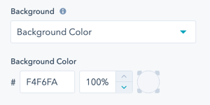
Bento Grid Module → Wrapper(s) → Style → Background → Background Image
Select an Image for the Wrapper background.
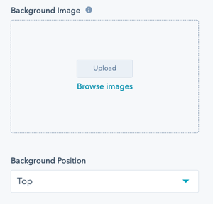
Bento Grid Module → Wrapper(s) → Style → Background → Background Image → Background Position
Choice of Bottom, Center, Left, Right, or Top.
For the Image, you can choose where the focal point is within the content area.
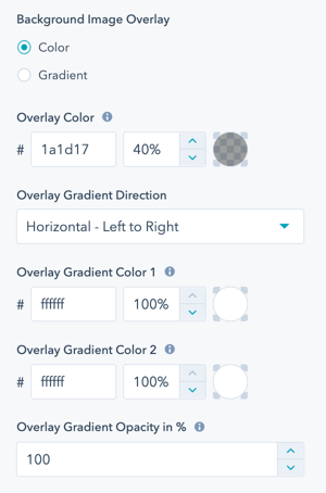
Bento Grid Module → Wrapper(s) → Style → Background → Background Image → Background Image Overlay
Option to add an overlay to the background image, as a single color or gradient.
Setting the opacity for the color or gradient is required to see the image through the overlay.
For the gradient option, you can either set an opacity per gradient color or an overall opacity for the entire gradient.
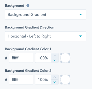
Bento Grid Module → Wrapper(s) → Style → Background → Background Gradient → Background Gradient Direction
Choice of Horizontal - Left to Right, Vertical - Top to Bottom, Diagonal - Top Left to Bottom Right, or Diagonal - Bottom Left to Top Right.
Define each of the background gradient colors by the color hex code or use HubSpot’s color picker. Additionally, the opacity of each color can be set.
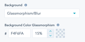
Bento Grid Module → Wrapper(s) → Style → Background → Glassmorphism/Blur
Define the background color by the color hex code or use HubSpot’s color picker to be used to create the Glassmorphism/Blur effect. Additionally, the opacity of the background color can be configured.
For browsers that do not support this effect, a non-blur version will be set.
Bento Grid Module → Wrapper(s) → Style → Background → Transparent
If set to transparent, the background of the Column behind the Wrapper will be visible.
Bento Grid Module → Wrapper(s) → Style → Background → Custom Hover Background
Here you can set a specific background to display on your wrapper when a cursor hovers over this wrapper.
Bento Grid Module → Wrapper(s) → Style → Custom Class
Here you can set a custom css class to target your wrapper specifically to use CSS in a custom stylesheet.
Adding Content to a Wrapper
Bento Grid Module → Wrapper(s) → Content(s)
Adding Content is how you will add content items to your Module.
Choice of Button/Link, CTA, Icon, Icon with Text, Image, Intro Title, Line, Logo, Menu, Rich Text Field, Social Icons Spacer or Title.

Bento Grid Module → Wrapper(s) → Content(s) → Internal Name
If left blank the Internal Name will default to "Content(s) 1, and continue in sequential order for each content in the wrapper.
We recommend adding a name for your sanity.
Bento Grid Module → Wrapper(s) → Content(s) → Title
Add a Title to your Wrapper using the default style. To customize the style of the Title in your Module, use the Rich Text Field content type.
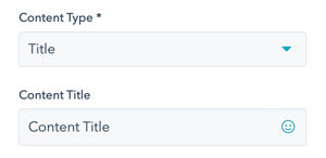
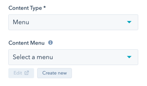
Bento Grid Module → Wrapper(s) → Content(s) → Menu
Add a Menu to your Wrapper to add a series of links as you would have in a typical menu.
Click Create new to configure an advanced menu for the links needed for this column wrapper.
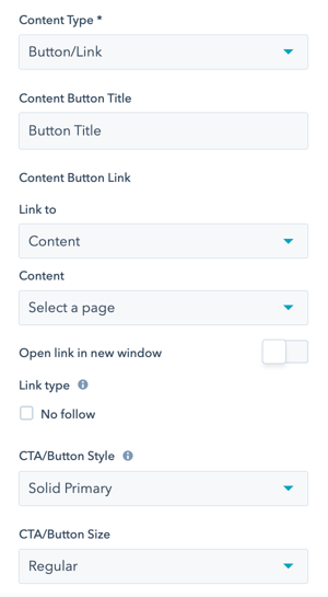
Bento Grid Module → Wrapper(s) → Content(s) → Button/Link
Add a Button or individual Link to your Wrapper that can be styled using any of the CTA/Button Styles, including the Link style.
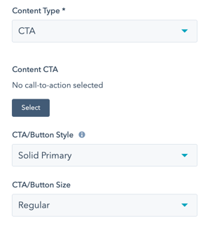
Bento Grid Module → Wrapper(s) → Content(s) → CTA
Add a CTA to your Wrapper that can be styled using any of the CTA/Button Styles, including the Link style.
We recommend using the Button/Link content type if you do not need to track conversions. Adding multiple CTAs can cause an impact on your page speed due to the amount of code needed for the HubSpot tracking code.
Bento Grid Module → Wrapper(s) → Content(s) → Form
Add a Form to your Wrapper that can be styled using any of the Form and Button styles.
The Form style can be changed under Bento Grid Module → Style → Form Style
⚠️ Please note that incorporating HubSpot forms may have an impact on page speed, so it's advisable to use them on pages that are not SEO-sensitive.

Bento Grid Module → Wrapper(s) → Content(s) → Icon
Add an Icon to your Wrapper with the option to use the icon library or load your own image icon.
Please use an image with dimensions 30x30 px or 60x60 px for retina displays

Bento Grid Module → Wrapper(s) → Content(s) → Icon → Icon Size
Set the size of the icon in pixels.
![]()
Bento Grid Module → Wrapper(s) → Content(s) → Icon → Icon Color
Define the icon color by the color hex code or use HubSpot’s color picker.
Bento Grid Module → Wrapper(s) → Content(s) → Icon With Text
Choice between an image, font awesome free or font awesome pro.
Bento Grid Module → Wrapper(s) → Content(s) → Icon With Text → Icon/Image Size
Set the size in pixels for your icon or image.
Bento Grid Module → Wrapper(s) → Content(s) → Icon With Text → Icon Color
Set the color of your icon.
Bento Grid Module → Wrapper(s) → Content(s) → Content Title/Text
Title and text within your module section
Bento Grid Module → Wrapper(s) → Content(s) → Icon With Text → Content Button Title
Text displayed within your button.
Bento Grid Module → Wrapper(s) → Content(s) → Icon With Text → Link
Set a link for your button.
Bento Grid Module → Wrapper(s) → Content(s) → Icon With Text → CTA/Button Style
Choose a style defined in your theme settings for your CTA or button.
Bento Grid Module → Wrapper(s) → Content(s) → Icon With Text → CTA/Button Size
Choice between regular, long, small, large or full width.
Bento Grid Module → Wrapper(s) → Content(s) → Icon With Text →Icon Style
Choice between a square or circular icon,
Bento Grid Module → Wrapper(s) → Content(s) → Icon With Text → Icon Position
Choice to position your icon to the left or right of your content.
Bento Grid Module → Wrapper(s) → Content(s) → Icon With Text → Gap Between Icon and Text
Set spacing between your icon and text.
Bento Grid Module → Wrapper(s) → Content(s) → Icon With Text → Vertical Alignment
Align your content vertically within your module.
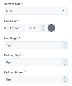
Bento Grid Module → Wrapper(s) → Content(s) → Line
Define the line color, opacity, height, and padding for the top and bottom of the line.
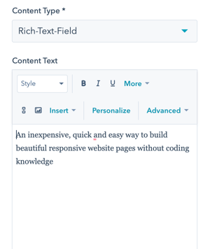
Bento Grid Module → Wrapper(s) → Content(s) → Rich Text Field
The Rich Text Field is the most flexible option for adding content to your Bento Grid Module. There is so much you can do!
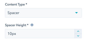
Bento Grid Module → Wrapper(s) → Content(s) → Spacer
Set the height of the Spacer in pixels.
Add a spacer to the wrapper to separate content or align with content in other columns.
Visbility
Choose to hide your module on specific screen sizes. For more information see common module information.
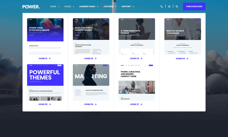
POWER Header → Advanced Mega Menu → Layout → Width of Mega Menu
Content Width
POWER Header → Advanced Mega Menu → Layout → Column Layouts & Widths
4 Columns - [ 3 | 3 | 3 | 3 ]
POWER Header → Advanced Mega Menu → Layout → Compensate Outer Column Padding
None
Sub Area Top and Sub Area Bottom
None
POWER Header → Advanced Mega Menu → Mega Menu(s) → Style → Color Scheme
Light
Border Radius
Checked
Border Radius → Only for Bottom Corners
Checked
Top Border
Checked
Bottom Shadow
Checked
Background → Background Color
#FFFFFF
POWER Header → Advanced Mega Menu → Mega Menu → Column 1-4 → Layout → Alignment Vertical
Top
POWER Header → Advanced Mega Menu → Mega Menu → Column 1-4 → Style → Border
Column 1, 2, 3 = Right, Column 4 = None
POWER Header → Advanced Mega Menu → Mega Menu → Column 1 -4
Columns 1, 2, and 3 each have 2 wrappers; Column 4 has 1 wrapper.
POWER Header → Advanced Mega Menu → Mega Menu → Column 1-4 → Wrapper 1 → Content 1 → Rich Text Field
Thumbnail of Template, 317px x 317px
Border Radius for images from Theme Settings > Styling > Corners > Overwrite for Images
POWER Header → Advanced Mega Menu → Mega Menu → Column 1-3 → Wrapper 2 → Content 1 → Button/Link
CTA/Button Style = Link
POWER Header → Advanced Mega Menu → Mega Menu → Column 1-4 → Wrapper 1- 2 → Layout → Alignment Horizontal
Center
Add Padding to Wrapper?
Not checked
Add Border Radius to Wrapper?
Not Checked
Ready to Start?
To help make things easier for you to get started with our Bento Module, we have created 9 section templates using this module. Find out how to add section templates to your HubSpot CMS pages here.


_enhanced.jpg?width=300&name=pwr-entry__hero-bg-(1)_enhanced.jpg)


