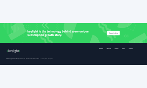
POWER Sec CTA Module
How to configure the Sec CTA module for POWER Pro theme in HubSpot
Very minimal impact to page load speed when used as a button and when you keep the number of CTAs on a page low.
Can increase page load speed when using a HubSpot CTA.
HubSpot's tracking code for CTAs adds extra code to the page that has to be loaded.
Only use CTAs for actions that are part of your critical conversion path(s) or that you are actively tracking in a campaign.
Buttons can be set up to match any CTA style from your theme settings, including the 4 custom styles.
What is the difference between a Mini CTA and Sec CTA?
The Mini CTA can be used in a custom drag-and-drop section and the Sec CTA is designed to be used as an section.
Title
The main heading for the section; can be left blank to hide on the page.
Title - Header Type
Choice of H1, H2, H3, or H4. This is how Google will determine the heading type. This does not control the formatting of the font, there is a separate setting under Style → Title Size to determine how the heading will display.
Description
You can add any amount of body text here or it can be left blank to hide on the page.
Button(s)
Add or remove a number of Buttons, CTAs or add a blank space with a "none" choice.

Button(s) → Button Type → CTA
When CTA is chosen, the option to Choose CTA is available which opens the HubSpot CTA sidebar where you can choose an existing CTA or create a new CTA.
Button(s) → Button Type → Button
When Button is chosen, additional settings are available to configure the button.
Button(s) → Button → Button Title
Button Title is the text that will appear on the button
Button(s) → Button → Button Link
The Button Link dropdown allows you to choose the type of link to include for the button: External, Content, File, Email Address, Blog, Phone number, Payment or Pop-up CTA.
Based on your selection, you can either add the URL, email address or phone number or choose the page, file, blog post, Pop-up CTA or payment link.
Button(s) → Button → Open in New Window
There is a toggle to allow you to open the link in a new window. The default is set to open in the same window/tab.
Tip: If your link is leaving your website, it is recommended to open it in a new window.
Button(s) → Button → Link Type
There is a check box for "No Follow" which allows you to indicate that the link is not associated with your website. This setting has SEO implications if used incorrectly.
Button(s) → Button → Use Internal URL instead
If this is to use an on page anchor link to link to another part of your page. Adding an item in here will overwrite any links chosen previously for this button.
Button(s) → Style → CTA Style
Option to choose any of the CTA/button styles configured in your theme settings including:
- Solid Primary
- Solid Regular
- Solid Regular for Primary Background
- Border Primary
- Border Regular
- Link
- Link Back
- Custom 01
- Custom 02
- Custom 03
- Custom 04
Button(s) → Style → CTA Size
Ability to override the default size of the CTA with choices for Regular, Long, Full Width, Small, and Large.
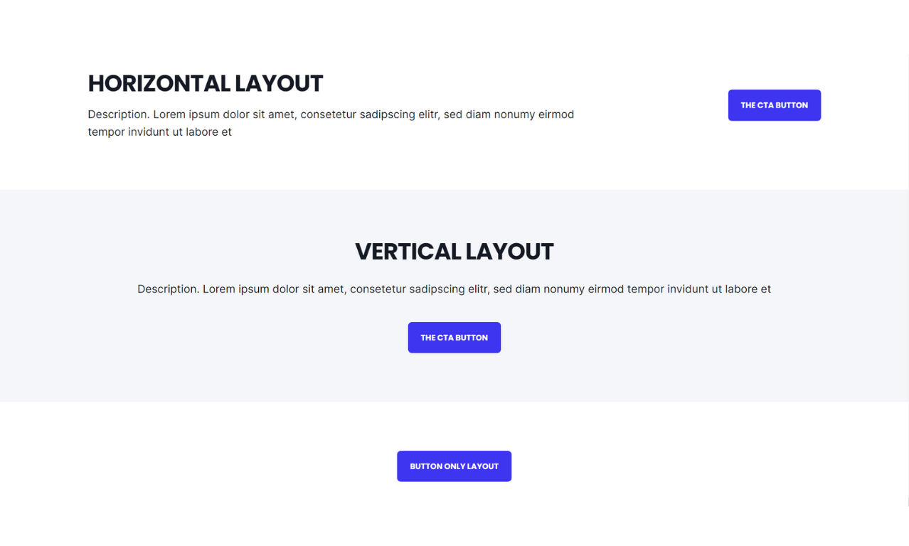
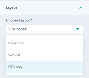
Layout → Choose Layout
There are three layout options available: Horizontal, Vertical, or CTA-only
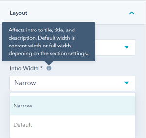
Layout → Intro Width
This allows you to control the width of the text, with two choices: Narrow or Default.
The module is set to "Narrow" when you add it to the page (this was the original layout prior to adding this choice as a setting). Narrow limits the width of the section text (title, and description) within the section.
"Default" allows the text to fill the width of the module; the width is dependent on whether the section is set to "content width" or "full width" in the section settings.
Layout → Centered
By default, the section text (intro to title, title, and description) is left-aligned. If you want the text to be centered, you can check this box.
Layout → Padding & Margin Top and Bottom
Choice of Standard, None, Small, Medium, Large, or First Section with Header. Refer to your theme settings for these for more information on this sizing.
Style → Color Scheme
Choice of Light, Dark, or Primary.
Tip: If you change the background color for the module, the definition of Light Color scheme is a light background with dark text and Dark Color scheme is a dark background with light text. Based on your background color, you would need to toggle the color scheme to ensure the text color displays properly and is legible.
Style → Title Style
The Default uses the text style from the Theme Settings based on the color scheme selected.
You can override the Theme Settings by choosing Color or Gradient and completing the corresponding color settings.
Style → Title Size
The Default is set to match what you chose for Title Header-Type, what Google sees from an SEO perspective. This setting gives you the option to change the Title Size to H1, H2, H3, H4, H5, or H6 so that the text will be styled based on your Theme Settings for the corresponding header tag chosen here.
Style → Background
Choice of Background Color, Background Image/Video, Background Gradient, or Transparent. Refer to Settings that apply to all Section Modules for more details about these choices.
Style → Shape Divider
Optional Shape Divider(s) can be added to the top or bottom of this module. Refer to Settings for configuring Shape Dividers for more details about these choices.
Animation
Checkbox to turn on/off Animate on Scroll. Turning off here will only apply to this section, to turn animation off globally refer to Theme Options for Animations.
Animation → Section
Ability to change the Animation Type and Delay for the Section.
Animation → Title
Ability to change the Animation Type and Delay for the Title.
Animation → Description
Ability to change the Animation Type and Delay for the Description.
Animation → Button/CTA
Ability to change the Animation Type and Delay for the Button/CTA.
Tip: When modifying animation settings for an individual section, we recommend opening the preview link in a separate tab so you can easily preview the changes as you make them by refreshing the page.
Visbility
Choose to hide your module on specific screen sizes. For more information see common module information.
Anchor Link ID
Set an anchor link for the module. Can be used to create a link directly to that section on the page and/or to include in an on-page menu (like Sticky Sub-Menu) to allow users to jump to that section without scrolling.
Easily add an anchor link to this section, for full instructions refer to Setting up Anchor Links.
Custom Class
Ability to add a Custom Class to use in the child.css for individual customizations.
See full instructions for setting a Custom Class for Section Modules.
Is in Viewport?
Performance setting to determine how the CSS is loaded for the module.
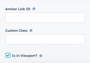
If the module is at the top of the page and located within the viewport of the browser, check this option to ensure the CSS loads on page load.
If the module is outside of the viewport, especially on mobile, uncheck this box so the CSS loads asynchronously.
Learn more about this setting as it relates to Page Speed and Core Vitals.
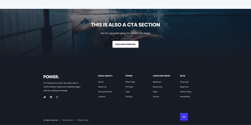
Layout → Choose Layout
Vertical
Layout → Padding Top and Padding Bottom
Standard
Style → Color Scheme
Dark
Style → CTA Style
Solid Regular for Primary Background
Style → Background
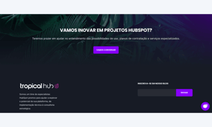
Background Image, 2560px x 1707px
Style → Background → Background Position
Center
Style → Background → Background Image Overlay
Gradient
Style → Background → Overlay Color
#1a1d17 set to 40%
Style → Background → Gradient Direciton
Vertical - Top to Bottom
Style → Background → Overlay Gradient Color 1
#171b25 set to 40%
Style → Background → Overlay Gradient Color 2
#171b25 set to 100%
The overlay gradient colors should match the color used for the footer or the section above or below the CTA section that you want to blend it with.
DESIGN SOMETHING COOL WITH THIS POWER MODULE?
Share it with us!- MODULE OVERVIEW
- SEC Accordion
- SEC Breadcrumbs
- Coming Soon
- SEC CTA
- SEC Form
- SEC Images
- SEC Map
- SEC Post Preview
- SEC Simple Listing
- SEC Stats Counter
- SEC Steps
- SEC Timeline
- Sticky Sub-Menu
- SUB Accordion
- SUB Stats Counter
- SUB Steps
- Mini CTA
- Mini Icon
- Mini Tag
- Previous Next Navigation
- Page Settings
- HS Heading
- HS Divider
- HS Rich Text
- Back to Module Library


_enhanced.jpg?width=300&name=pwr-entry__hero-bg-(1)_enhanced.jpg)


