Global Footer Settings
How to configure the footer for your HubSpot website theme
The footer module has very little impact on page speed.
Logo size and file format can impact your page speed if not sized appropriately.
The subscription form in the footer will add a slight increase in load time (limited to the email field only for this reason).
For the best quality, we recommend SVG for your logo sized at 120px wide.
Consider creating a section containing your newsletter subscription outside of the footer and only placing it on key conversion pages.
The copyright text can be configured directly in the footer module. Please watch this video for further details.
The footer is designed to contain a Subscription Form that has just one field for Email Address.
Adding additional fields breaks the styling and is not recommended due to the impact on page speed.
Step-by-Step Instructions coming soon for the Advanced Footer, please submit a ticket if you have questions.
Page Editor → POWER Footer
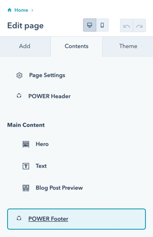
POWER Footer → Global Content
Once you have accessed the global module, you will have the choice to set up 4 variations for the footer.
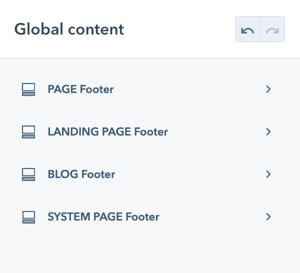
We recommend configuring the footer for all page types at the beginning, even if you don't plan on using one of them (i.e. blog or landing pages) so that you have a consistent starting point if anything changes.
It is also possible to override the default footer for an individual page, so an unused footer type could be styled for this situation.
Footer Types for POWER Theme
- PAGE Footer is the default for website pages
- LANDING PAGE Footer is the default for landing pages
- BLOG Footer is the default for the Blog Listing and Blog Post templates
- SYSTEM PAGE Footer is the default for the 404, 500, and Search templates
While Subscription templates are system pages and they typically use the LANDING PAGE Footer, some accounts are using the PAGE Footer for these pages with no clear explanation from HubSpot.
Each footer type includes the option to include a Copyright Bar.
Settings → Account Defaults → Branding → Company Info
A Legal Notice is included in the Footer and consists of your legal menu (Terms of Use, Privacy Policy, etc.), the Year and Company Name.

Publishing the Global Footer
When you're ready to publish the Global Footer, you'll click the orange Publish to X Assets button in the upper right corner. The number of assets corresponds to the total number of assets using this specific child theme that contains any of the footer types.

It is important to note that if you make a change to the BLOG Footer, you'll have to publish the footer to ALL assets, not just the blog assets. This is true for each footer Type, whether you are configuring every footer or making a change to an individual setting - until you Publish to X Assets, your changes will not be visible on your preview pages and live site.
There are some settings that are only visible based on previous choices, if you do not see the option available, it does not work with the layout or selections you've already made.
These settings are available for each Footer Type. We recommend opening a second browser window once you have the PAGE Footer configured to make it easier to apply the same settings for the other footer types and modify as needed.
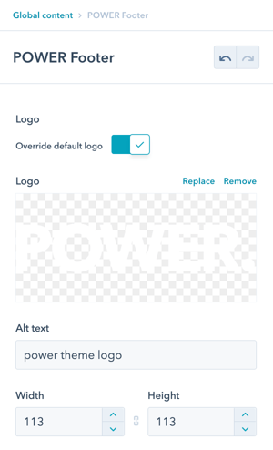
POWER Footer → Logo
The footer uses the same pre-configured global logo that you added when setting up the header.
Option to Override default logo and Override Logo Sizes.
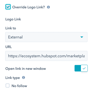
Option to Override Logo Link allows you to replace the preconfigured link from the global HubSpot settings.
POWER Footer → Link Type
Configure the Link Text and Link To if using Layout → Footer Simple (this setting won't be visible until you change the layout).
Options for Link To are: External, Content, File, Email Address, and Blog.
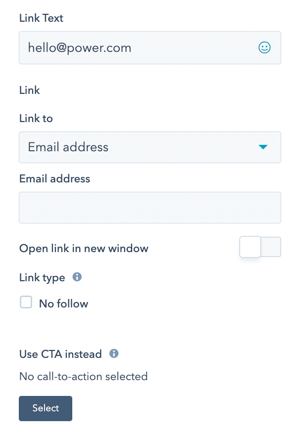
Option to Use CTA instead if you would like to use a CTA, you'll need to add the class "pwr-link" in the CTA settings, learn more about setting up CTAs for POWER theme.
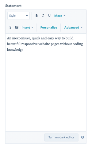
POWER Footer → Statement
The Statement allows you to include a company description in the Footer when using the Footer Full layout.
POWER Footer → Social Icons
The footer includes 3 pre-configured social icons for Twitter, LinkedIn, and Instagram.
Make sure you update the URL to your social accounts or remove ours. :)
![]()
POWER Footer → Menu
Choose your navigation menu from the Menu dropdown to select your footer navigation. Help with Navigation Menus.
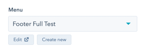
The number of columns in your navigation will affect the layout of the footer module.
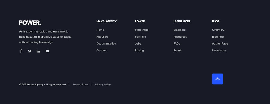
To create a footer with full navigation (Layout → Footer Full), we recommend a menu with 6 columns:

To create a footer with logo/company info/social icons (Layout → Footer Full), we recommend 4 columns:
POWER Footer → Menu Right
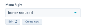
Choose your navigation menu from the Menu Right dropdown to select your footer navigation if using Layout → Footer Reduced (this setting won't be visible until you change the layout). Help with Navigation Menus.
POWER Footer → Subscription Form
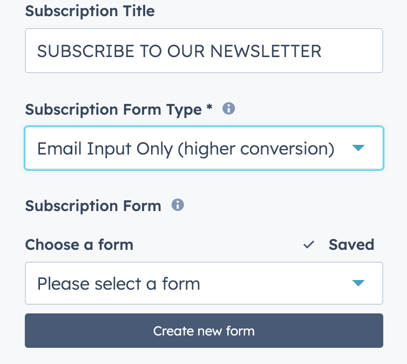
Edit Subscription Title to include a title for your Subscription Form in the Footer.
Choose your Subscription Form or create a new form.
The number of navigation columns should be limited to 2 when using the Subscription Form.
If you have chosen the Footer Full layout type. The Subscription Form Type allows you to set the layout type for your subscription form. The options here are for an email-only input, which has a higher conversion type for subscription forms, or a full form.
POWER Footer → Subscription Form → Form Content
Set the field titles, Placeholders and help text that will display on your form. For more advanced form editing along with drag and drop on your fields the HubSpot form editor should be used.
A custom button text and Data privacy options can be customised in this section.
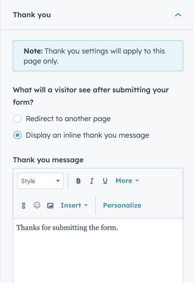
POWER Footer → Subscription Form → Thank You
Choose to have your form redirect to another page or display a thank you message when submit.
POWER Footer → Subscription Form → Form Automation
Choose to always create new contacts for a new email address. This will ensure cookies do not overwrite contact records if the email is new. There may be some considerations to enabling this.
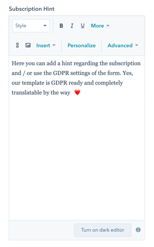
Edit Subscription Hint to include any relevant information regarding your Subscription.
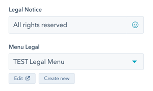
POWER Footer → Legal Menu
Edit Legal Notice to include your copyright or other legal information that will be separated with a "|" (vertical pipe) from the Menu Legal.
Choose your legal menu from the Menu dropdown to select your legal menu for the website footer. Help with Navigation Menus.
POWER Footer → Layout → Select Footer Type
This is where you will choose the layout of the footer
Choices are Footer Full, Footer Full Advanced, Footer Reduced, Footer Simple Link, and Footer Copyright Bar.
POWER Footer → Layout → Footer Full Advanced
The Advanced Footer allows you to create a custom footer layout.
Step-by-Step Instructions for setting up the Advanced Footer.
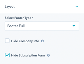
POWER Footer → Layout → Footer Full
This is where you'll choose the layout of your footer.
Check Hide Company Info to omit the Statement from the Footer Full layout.
Check Hide Subscription Form to omit the Subscription Form from the Footer Full layout.
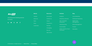
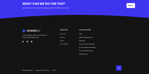
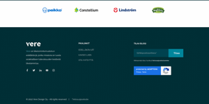
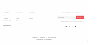
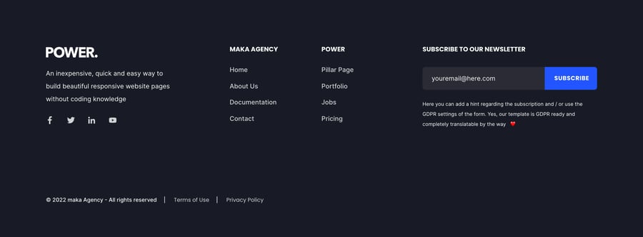
- Footer Full - recommended for showing a lot of information

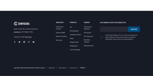
- Footer Full - with Subscription Form
POWER Footer → Layout → Footer Reduced
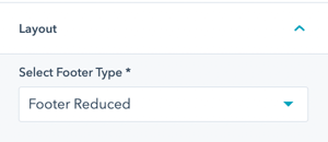
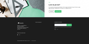
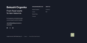
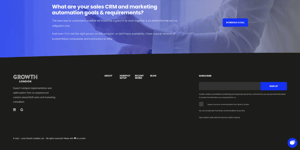
- Footer Reduced -a more compact way of presenting a short about text and a simple menu

POWER Footer → Layout → Footer Simple Link
Check Centered to center the link in the layout, otherwise left-aligned.
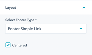
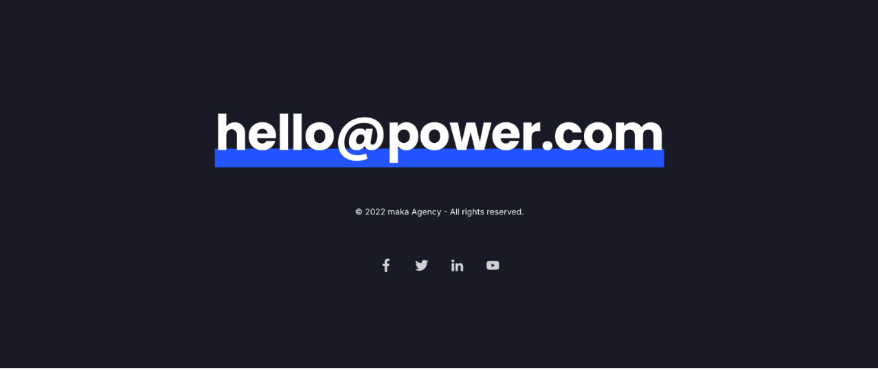
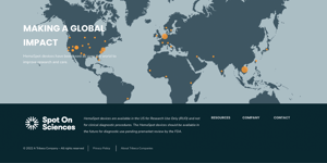
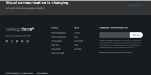
- Simple Link - shows a prominent link or email in combination with a minimal copyright bar and social icons

POWER Footer → Layout → Footer Copyright Bar
Check Centered to center the link in the layout, otherwise left-aligned.
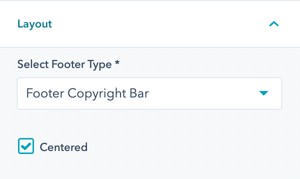
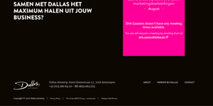
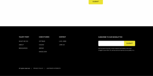
- Copyright Bar - the most reduced, showing only the copyright bar with an additional simple menu next to it

POWER Footer → Style
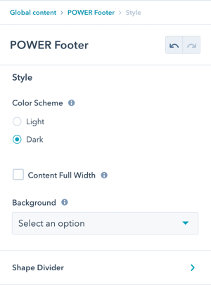
POWER Footer → Style → Color Scheme
Choice of Light or Dark for the main Footer.
The light scheme shows a light background color and a dark font and the dark scheme shows a dark background color and a light font color as defined in the Theme Settings for your child theme.


POWER Footer → Style → Content Full Width
Check Content Full Width to stretch the Footer content to the window borders instead of the container width (not recommended).

POWER Footer → Style → Background
Choice of Background Color, Background Image/Video, Background Gradient, or Transparent. Refer to Settings that apply to all Section Modules for more details about these choices.
POWER Footer → Style → Background Image/Video
Choice to add a primary background image or placeholder image for your video. Additional background images can be set for mobile and tablet specifically. If these are empty the primary image will be used across all screen sizes.
A background video for your footer can be uploaded or a youtube/vimeo link can be used.
Options to add a colour or gradient overlay and it's opacity can be set here.
POWER Footer → Style → Shape Divider
Optional Shape Divider(s) can be added to the top or bottom of this module. Refer to Settings for configuring Shape Dividers for more details about these choices.
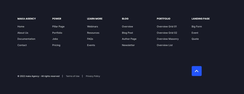
Layout > Choose Layout
Footer Full
Hide Company Info
Hide Subscription Form
Menu
6 Columns
Style > Color Scheme
Dark

Layout > Choose Layout
Footer Full
Hide Subscription Form
Menu
4 Columns
Style > Color Scheme
Dark

Layout > Choose Layout
Footer Full
Menu
2 Columns
Style > Color Scheme
Dark

Layout > Choose Layout
Footer Reduced
Menu Right
Top-level menu only, 4 items
Style > Color Scheme
Dark

Layout > Choose Layout
Footer Copyright Bar
Menu Legal
Legal Notice and Menu Legal
Centered
Style > Color Scheme
Dark

Layout > Choose Layout
Simple Link
Link
Centered
Style > Color Scheme
Dark


_enhanced.jpg?width=300&name=pwr-entry__hero-bg-(1)_enhanced.jpg)


