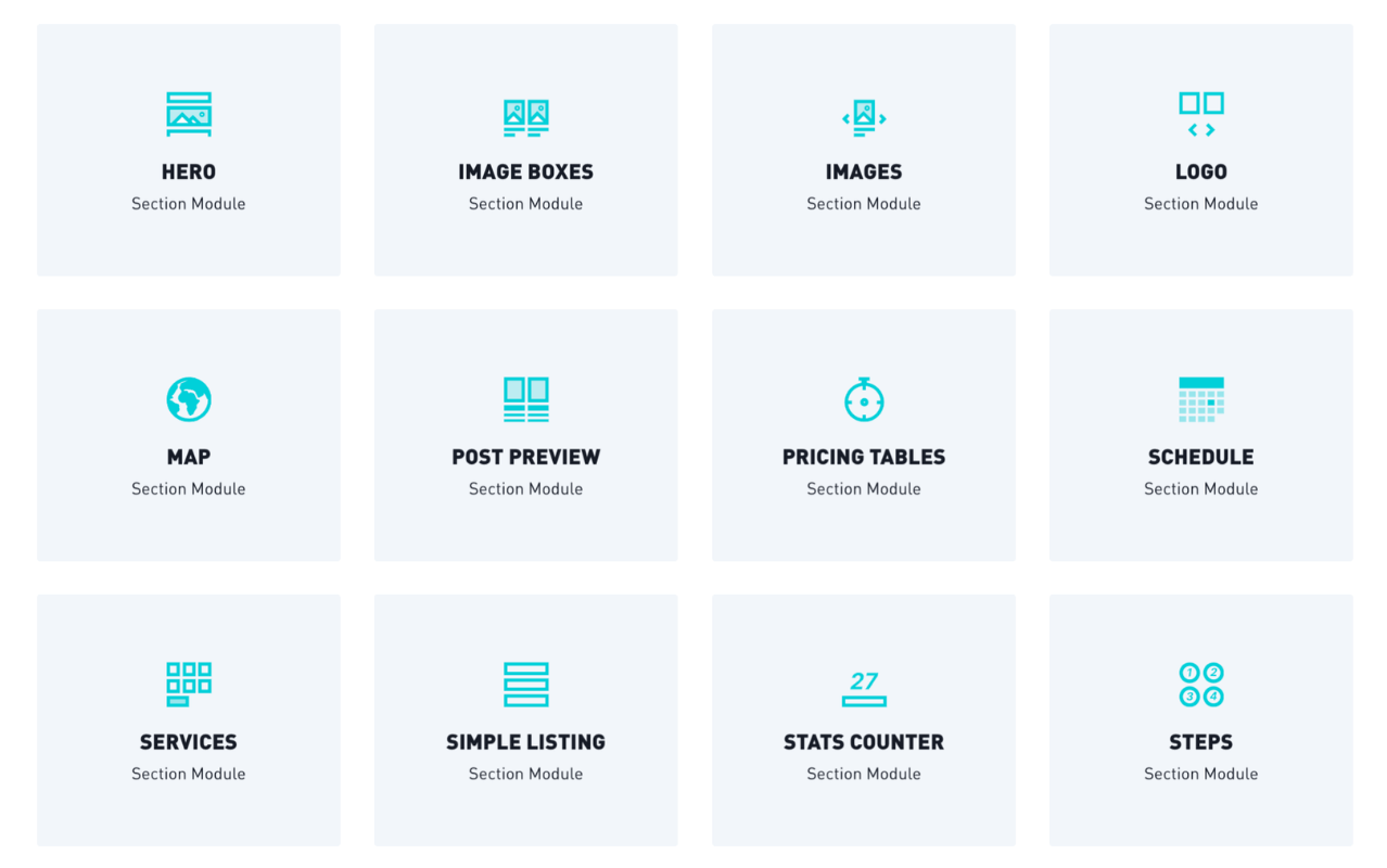
HUBSPOT THEME CUSTOM MODULES
POWER your website with versatile custom modules designed for growth
What is a Sub module?
A flexible module that allows you to build your own section layouts to create dynamic page designs.
With Theme Settings, you have the POWER to transform the theme into your brand's website. And with our custom modules, you'll discover the POWER to create professionally designed layouts in less time!
Preview the new Module Library under construction 👀
Module Types
There are three main types of modules, refer to our documentation for settings that apply based on the module type:
Section Modules, Sub Modules, and Mini Modules.
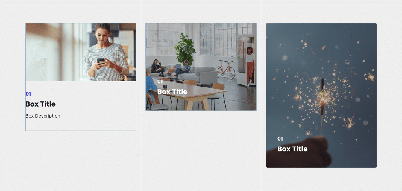
IMAGE BOX
Define the content of the image box here using the following options:
- Image: Represents the image shown in the image box
- Intro to Title: Pre-title for adding secondary information
- Title: Title of Image Box
- Description: Text shown below the image box or on hover (depending on chosen style)
- Link: Add a link to the image box. This is optional
- Use internal URL instead: Use this option to use anchor-links
- Link Icon: Icon shown next to the link in the image box
LAYOUT
- Centered: switch between left and centered content in the image box
- Image Height: Set a custom height of this image box
- Show more: Set the amount of your content which will display initially and what will be hidden behind a "show more" button.
STYLE
- Box Style: Switch content overlay and content below options
- Color Scheme: Switch between light and dark color scheme
- Smaller Font Size and Padding: Activate this for a smaller representation of font size and padding
- Image Background Position: Set the position of the background image here
Sub Pricing Tables
This sub-module allows you to create single pricing tables (1 column) which can be combined to represent a full pricing comparison table using the following options:
PRICE TABLE
- Title: Title of Pricing Table
- Description: Text shown in the pricing table describing the offered product
- Price: Price of the offered product
- Feature: Features of product
- CTA
LAYOUT
- Layout: Choose between full and reduced layout (examples see below)
- Show more: Set the amount of your content which will display initially and what will be hidden behind a "show more" button.
STYLE
- Table Style: Only visible if full layout was selected. Gives you further style options for the full layout.
- Highlighted: Activate this to color the pricing table in a highlight color
- Recommended: Activate this to add a recommended badge above the pricing table
- Custom Box Background Color: Gives you the option to set a custom background color for the pricing table
- CTA Style: choose among the predefined CTA styles
- CTA Size: choose among two different CTA sizes
Reduced layout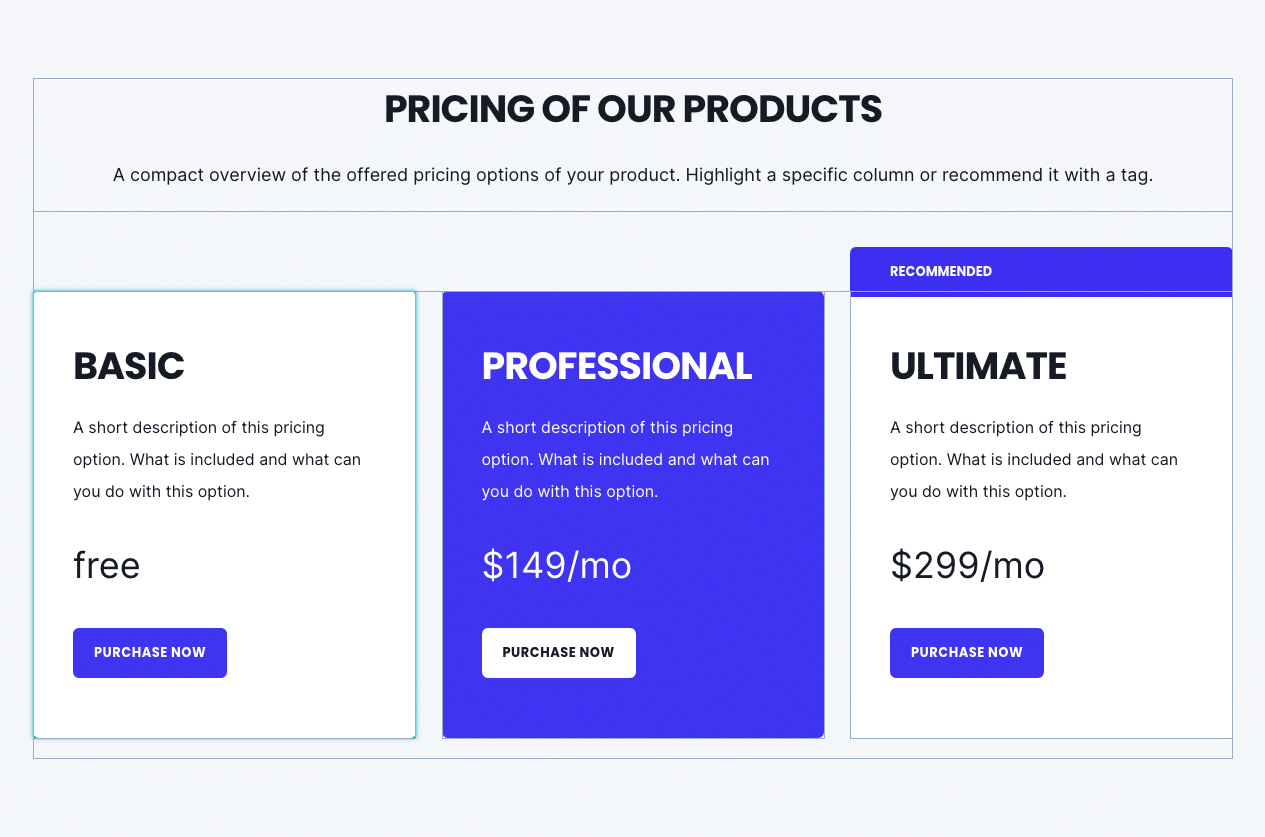
Full Layout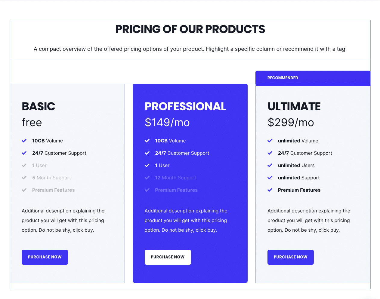
Show more enabled

Enabling the option "show more" under your layout options for this module will allow you to hide your content behind a "show more" button depending on the size of your content.
Within these options the "collapsed height" is the height of your module that you wish to set as the initially displayed section of your content. Any content that is above this collapsed height will be hidden initially behind your "show more" button. Within here you can set the initial height for your content within Desktop, Tablet and Mobile screen widths.
You can also customise your button style based on the standard theme button styles, or use any of your custom button styles.
Sub Services
SERVICE
- Title: Title of Service
- Icon: Iconpicker for icon shown in box, above title or next to title, depending on chosen layout
- Icon – Image: Same as above but with custom uploaded image.
- Description: Text shown in the service box/element
- Link: Optionally add a link to the service box/element
LAYOUT
- Layout: Choose between Icon left and boxed layout (see examples below)
- Centered: Switch between centered and left-aligned content options
- Always show link?: Unhides the service link by default
-
Show more: Set the amount of your content which will display initially and what will be hidden behind a "show more" button.
STYLE
- Color scheme/Box color scheme: Switch between dark and light scheme
- Icon color: Set your custom icon color. By default, the icon color corresponds to the ones given by the dark and light scheme
- Custom Box Background Color: Set your custom box color for the boxed layout. The default colors are given by the dark and light scheme
- Icon Size: Set your icon size in pixels
Layout variants: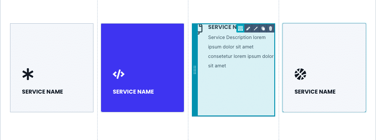
Sub Simple Listing
The simple listing element can be used to show open positions/jobs and on the press page to show a list of articles/downloads and many more.
LIST ITEM
- Title: Title of Simple Listing
- Description: Text shown in the simple listing, e.g. to describe the job position
- Link: Add a link to the simple listing. This is optional
- Link Icon: Icon shown next to the link in the simple listing
- Additional Info: Shows custom information built using a text and an icon
LAYOUT
- Layout: Choose between box and text layout (see examples below)
- Centered: Switch between left and center-aligned content
- Always show link?: Unhides the link for the text layout by default.
STYLE
- Color Scheme/Box color scheme: Switch between dark and light color scheme
- Box Color: If the box layout is selected, you will see this option to set a custom box color here
Layout variants
Sub Team
This sub-module is used to show a team member. The team box can be linked to a team-member page, which we also provided in this theme.
The following options can be configured:
TEAM
- Name
- Image
- Job Title
- Description: Can be used as a bio text. Only applies to the full layout.
- Contact: If activated, you can define many contact options (phone, mail, social media, etc.). These will be shown only in the full layout.
- Link: Optionally you can link the team member box to another page.
LAYOUT
- Layout: Choose between full and reduced layout (see examples below)
- Centered: If activated the content is centered, otherwise left-aligned.
STYLE
- Color Scheme: Switch between light and dark color schemes.
- Image Vertical Position: Shift the image horizontally by this value in percentage.
- Image Horizontal Position: Shift the image vertically by this value in percentage
Layout variants: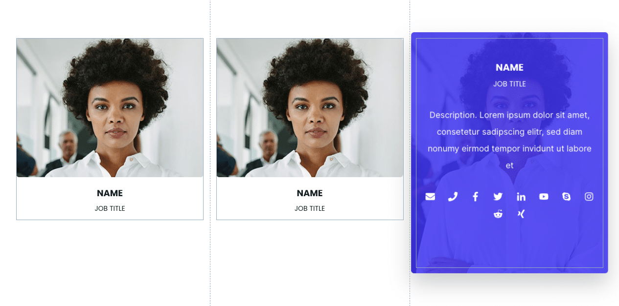
Sub Video Box
The video box sub-module provides visualization for video libraries, webinar pages, and sections.
VIDEO BOX
- Title: Title of Video Box
- Description: Text shown in the video box describing the video
- Link: Optionally add a link to the image box. The link only works, if no video is selected.
- Image: Image shown in the video box
- Video *.mp4: Select an mp4 file from your file manager or upload a new mp4-file. The video will open in a lightbox.
- Video – Youtube: Simply copy paste a youtube video link here. The video will open in a lightbox.
LAYOUT
- Centered: Switch between centered and left-aligned content.
STYLE
- Box color scheme: Switch between dark and light color scheme
- Custom Box background color: Set your custom box background color
- Image background position: Positioning of the image shown in the video box. Select among left, right, top, bottom, center
Preview: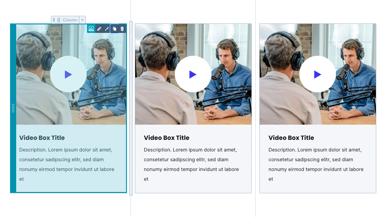
Section Modules
Section Images (Image Slider, Image Comparison, Image HotSpots)
Section Client Logo Slider
CLIENT LOGOS
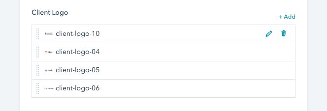
For each client logo, add one entry in the option above.
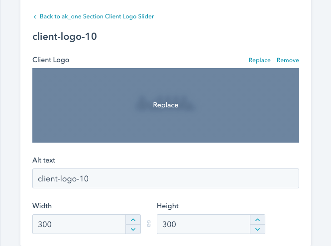
Upload or add an image from your file library. Once uploaded, width and height can be adjusted manually. We suggest a width of 300px. Also, make sure that all your logos have the same size.
AUTOPLAY
If active, the client logo slider rotates automatically. The autoplay duration can be set manually in milliseconds.

NAVIGATION – ARROWS
Turns on navigation arrows on the sides of the slider.

NAVIGATION – BULLET POINTS
Activates bullet points below the slider:

HOW MANY IMAGES SHOULD BE SHOWN?
The number of logos that should be shown at once / per slide.
Section Device Mockup
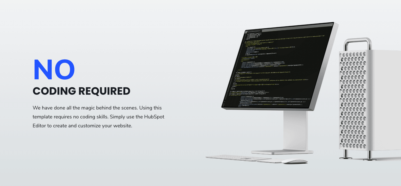
MOCKUP
Select the mockup graphic you want to show in this module. Make sure the image has a transparent background.
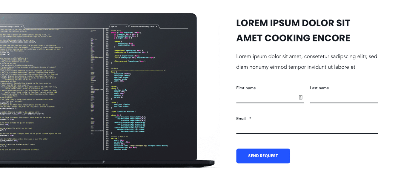
FORM
If a form should be included next to the graphic the form switch needs to be activated. Once activated, select a form.
CTA(S)
One or more CTAs can be added through the CTA picker here:

LAYOUT
Choose if the mockup graphic should be placed on the left-hand side or right-hand side.
FULL WIDTH
Activating this will position the mockup graphic at the border of the window as seen in the samples above.
MOCKUP WIDTH IN %
Actual width of the mockup is shown on the website in percent.
Note that this value can be set such that the graphic overlaps with the content area. Some mockup graphics have huge shadows in the background. With this method, the shadow is positioned behind the content area.
MAX MOCKUP WIDTH IN PIXELS
For very large screens we included this parameter to limit the size of the mockup. Make sure the entered value is in pixels.
CONTENT WIDTH IN %
Actual width of the content area is shown on the website in percent.
HIDE MOCKUP FOR MOBILE
Activating this switch hides the mockup graphic on mobile screens.
Section Hero
This module can be used as the intro-section. Multiple applications with this module are possible. It can be used as a hero section or as a title bar. Please note that this module can only be used once per website. Multiple hero modules on one specific site are not possible.
HEIGHT
Choose between different heights – large, regular, small and extra small.
Large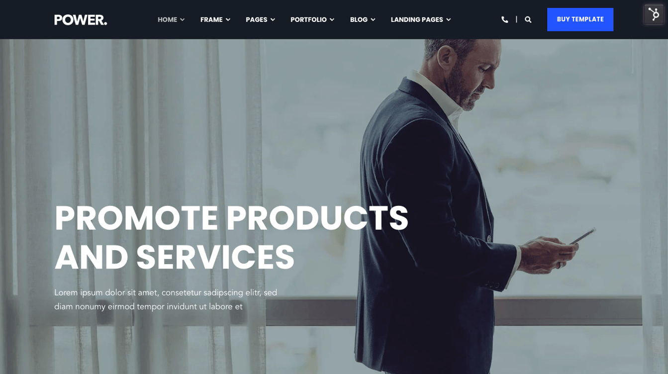
Regular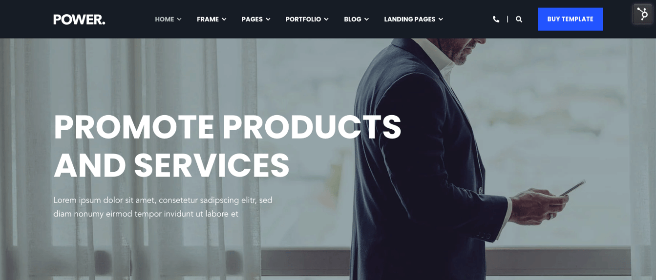
Small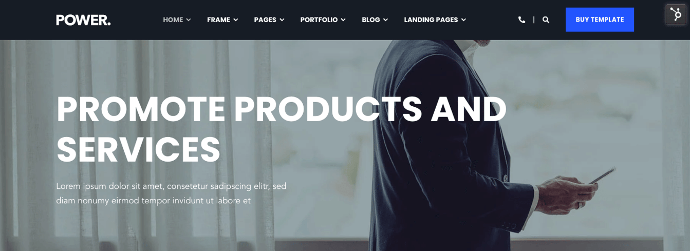
Extra Small
TITLE EXTRA LARGE
Activating this option will provide the extra-large layout seen below.

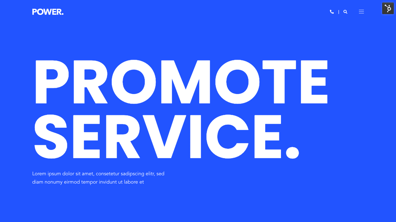
DESCRIPTION LARGE
This switch increases the size of the description text below the title in the hero section
Regular:
Large:
BASIC INFORMATION
Our template also allows placing basic information below the hero title, consisting of an icon and a short text.

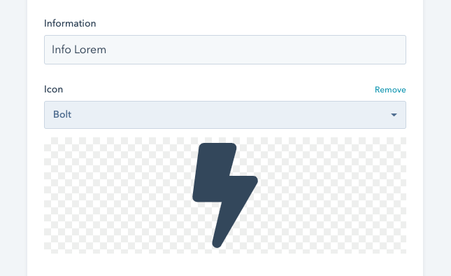
This is the result you get from the configuration above.


The hero module can also be used to generate more creative section as seen below.
Only custom background image.
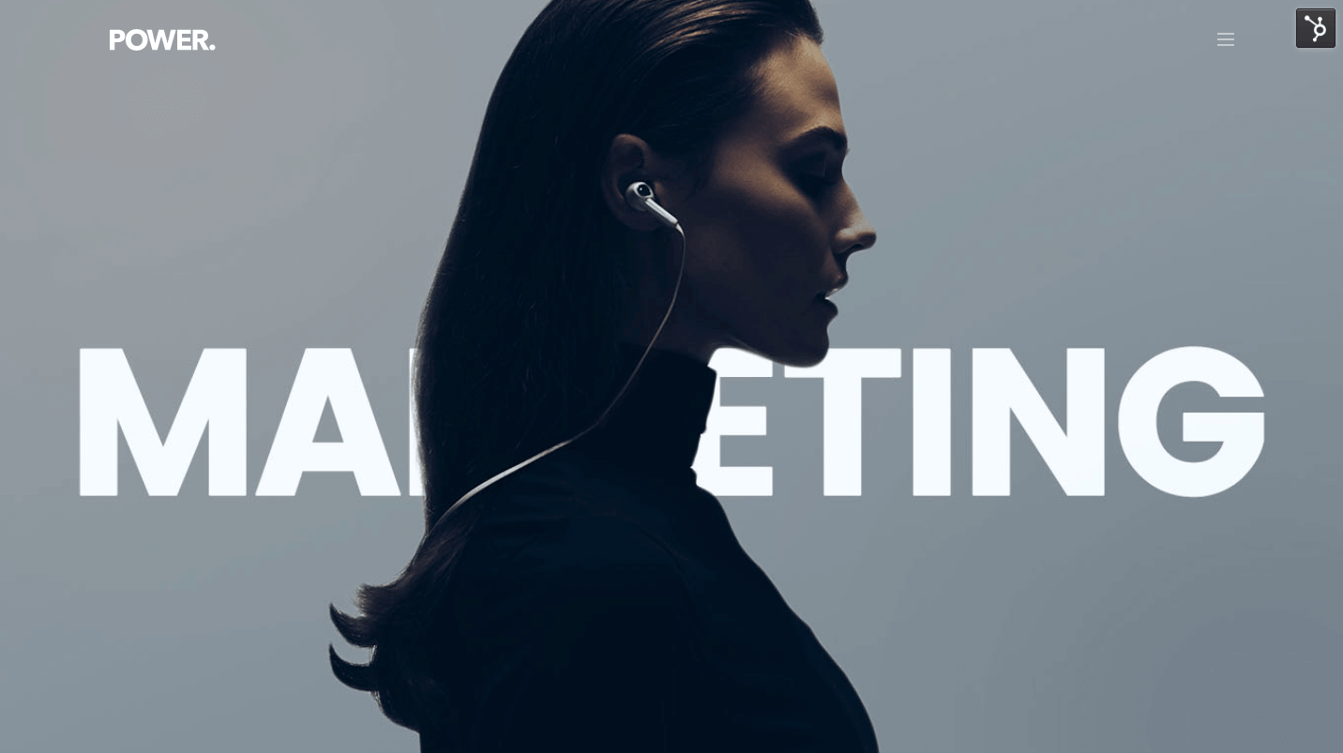
Only title.
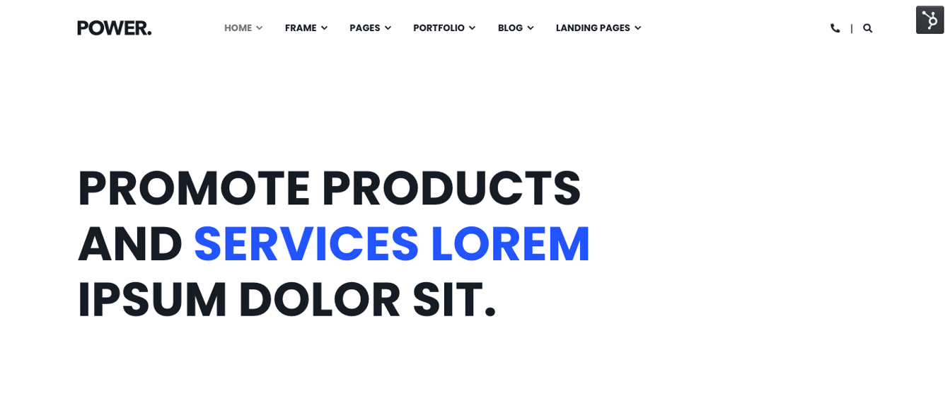
Section Image Boxes
This module is very versatile and can be used in many different ways – gallery, portfolio overview and many more.
Layout: 6 different layout options are possible
3 Column Grid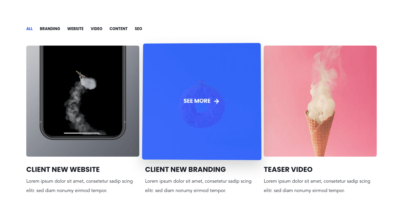
3 Column Grid Smaller Height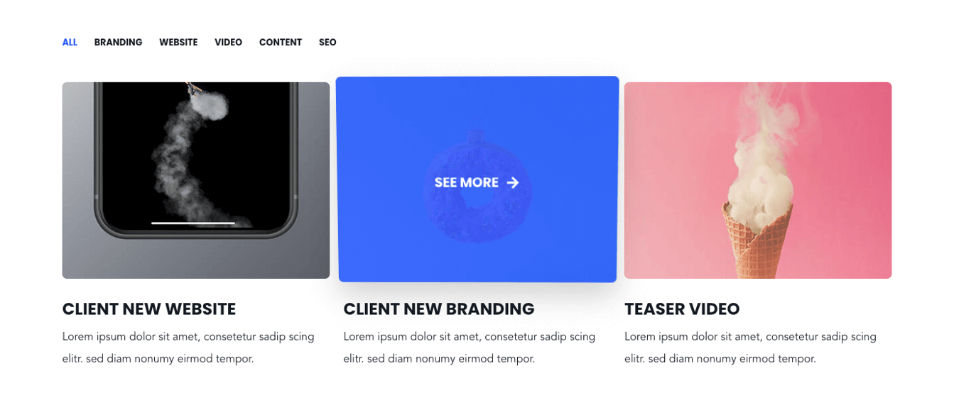
4 Column Grid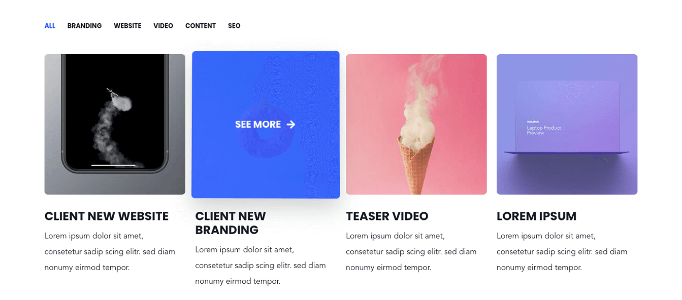
3 Column Masonry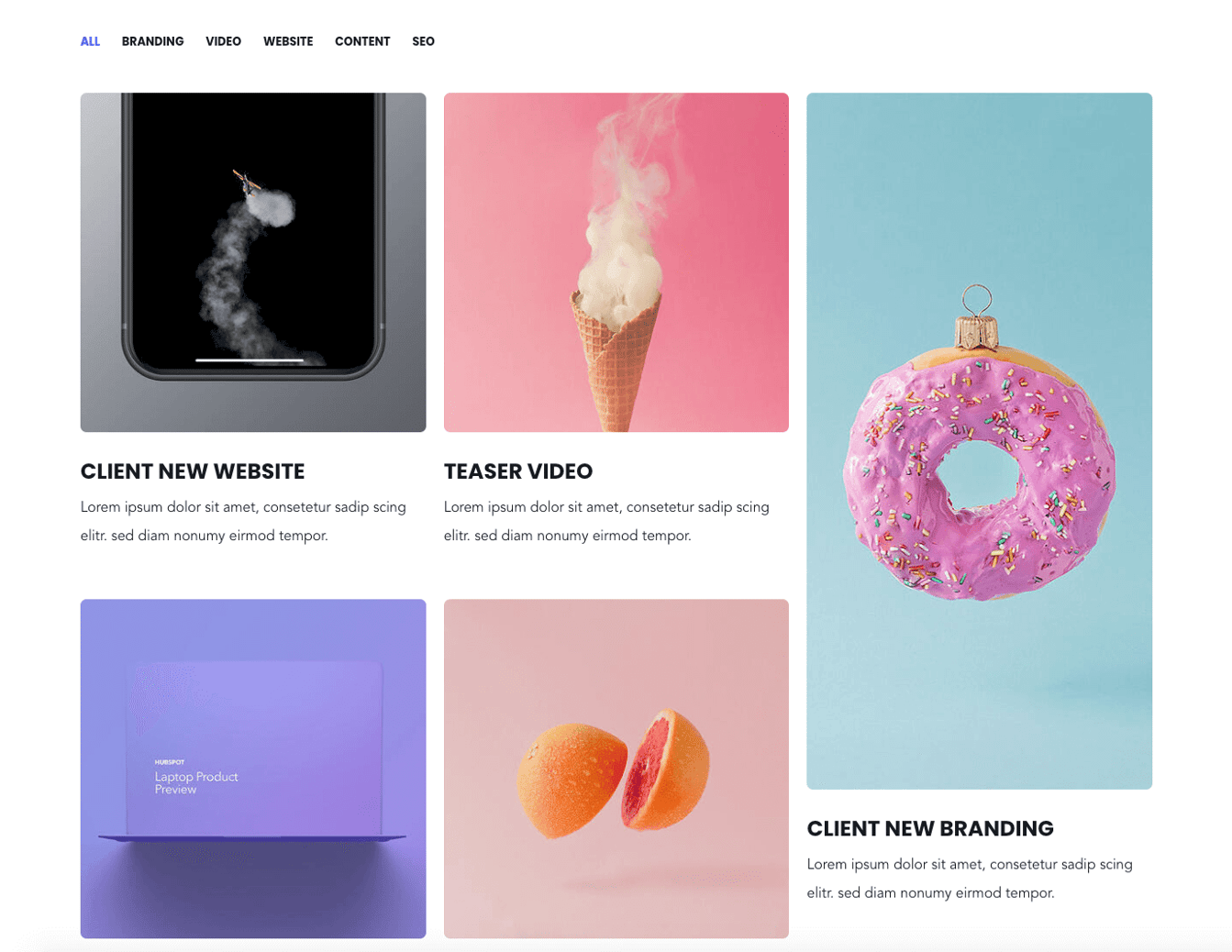
3 Column Masonry Smaller Height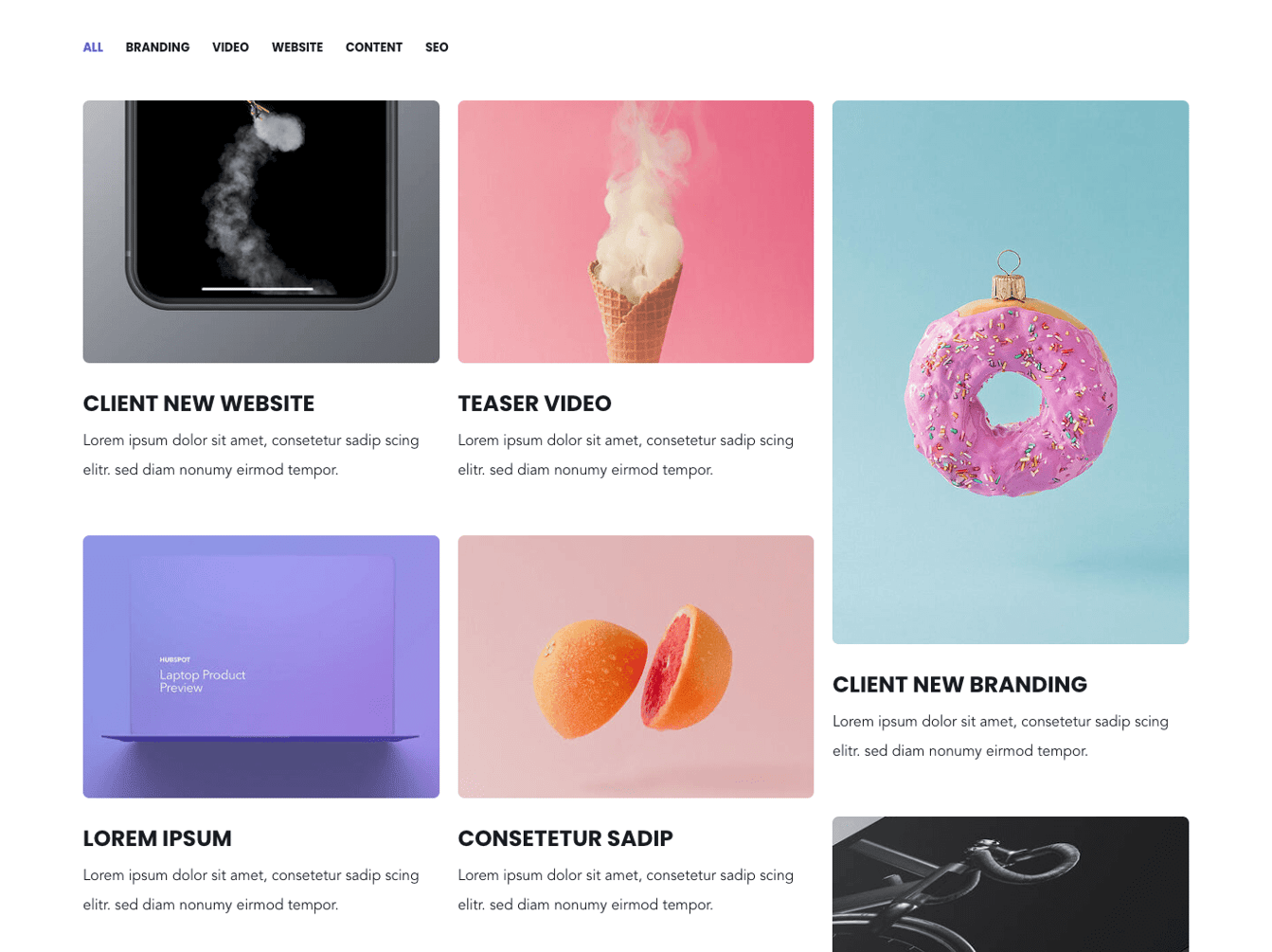
4 Column Masonry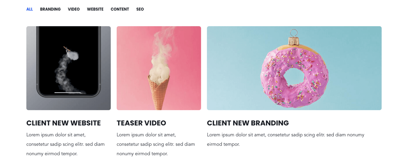
No Gutter: This option removes the spacing between the columns and rows.
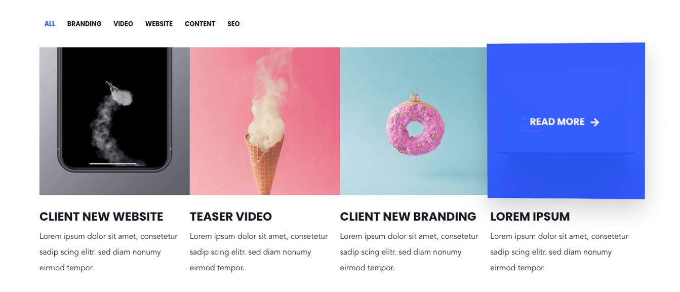
Box Style: Puts the text content above or below the box.
Box Style – Content Below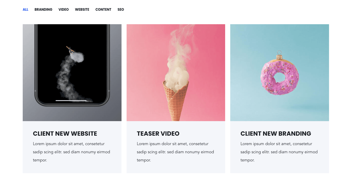
Box Style – Content Overlay
Smaller Font Size and Padding: reduces the padding and font size of the text content.

Use Overlay on Box Front: adds a transparent overlay on the boxes to make the text content above more readable.

Hide Info on Box Front: Removes all text content in the front page. Text will only be shown on hover.


Overwrite Box Colors: This enables you to change the background color and font color of the box style: “Content Below” with box style variant “with Background”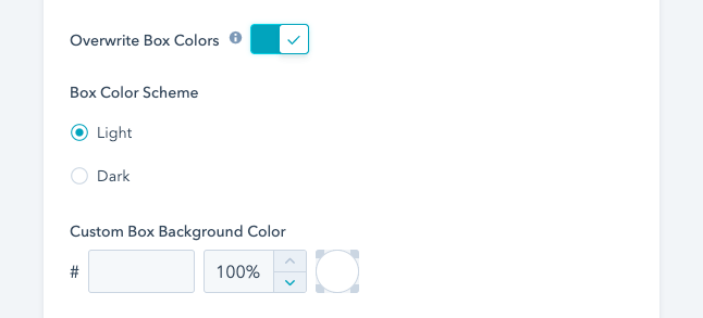
Use as gallery? With this option, the images are shown in a lightbox popup, when the user clicks on them.
Filtering: Comma separated categories can be configured for each image box. If image boxes shall be grouped in the same category, make sure to specify the same category names.
You can choose to show the category “All” and which category should be active on page load in the module settings.
Enabling the option "show more" under your layout options for this module will allow you to hide your content behind a "show more" button depending on the size of your content.
Within these options the "collapsed height" is the height of your module that you wish to set as the initially displayed section of your content. Any content that is above this collapsed height will be hidden initially behind your "show more" button. Within here you can set the initial height for your content within Desktop, Tablet and Mobile screen widths.
You can also customise your button style based on the standard theme button styles, or use any of your custom button styles.
Section Media Content Split
The media content split module is used to render a module which shows a 50:50 split-screen layout.
One side of the module always contains a single image or video. The video can be uploaded in mp4 format in HubSpot or one can link videos from YouTube.
The other side can include a title, description combination, a testimonial quote with a company logo, CTAs or Social Icons.
Is a testimonial: If turned on, the description will be rendered as a quote and additional parameters will appear, such as name and job title.
Name: Name of the quoted person.
Job Title: Job title of the quoted person.
Image / Logo: Include an image here, i.e. company logo of the quoted persons company.
Social- / Contact Icons: Create and define one or multiple icons. You have the option to link the icons, i.e. for social accounts.
CTAs: Select one or multiple HubSpot CTAs.
Layout: Here you have the option to flip the order of the content. Either show the image/video on the left or right.
1. Image Right + Testimonial
2. Image Left + Title + Description + CTAs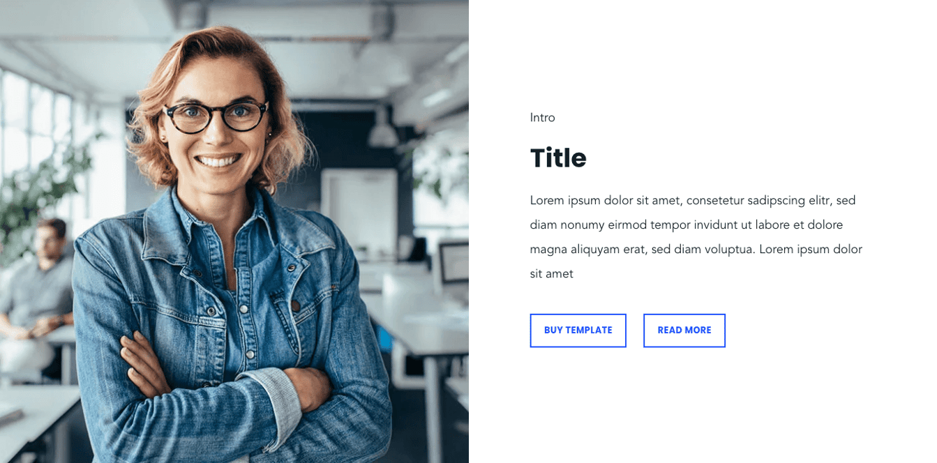
Section Pricing Tables
The POWER template offers a pricing table module. This module can display up to 3 pricing blocks in one row.
The specific pricing boxes need to be created separately here:
Creating and editing these pricing boxes will yield these parameters:
Title + Description: This is the intro part of each box.
Price: The main price of each pricing box. Numbers and Text is possible.
Feature: Each parameter set represents a feature.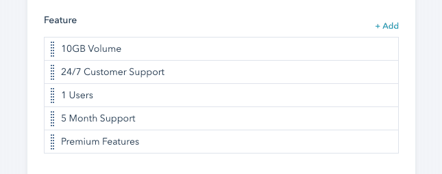
Each feature has the option to be deactivated:
CTA: Add one HubSpot CTA.
Highlighted: If activated, the pricing box is highlighted in the accent color.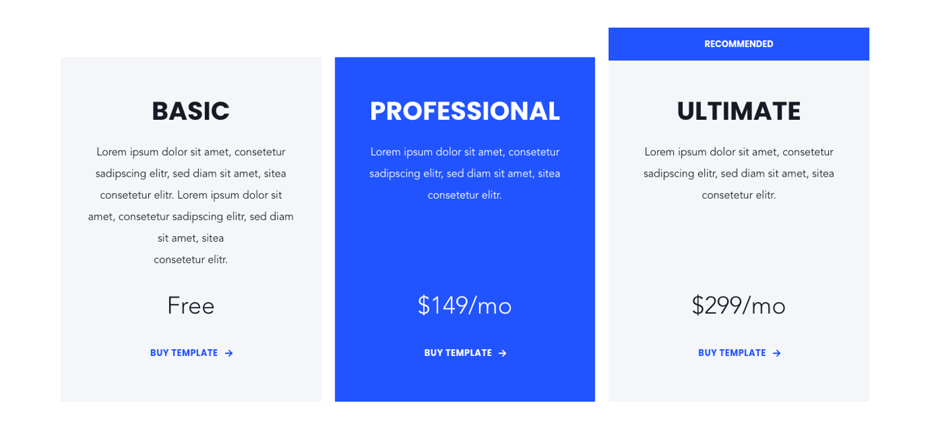
Recommended: If activated, a “recommended” tag is displayed above the pricing box.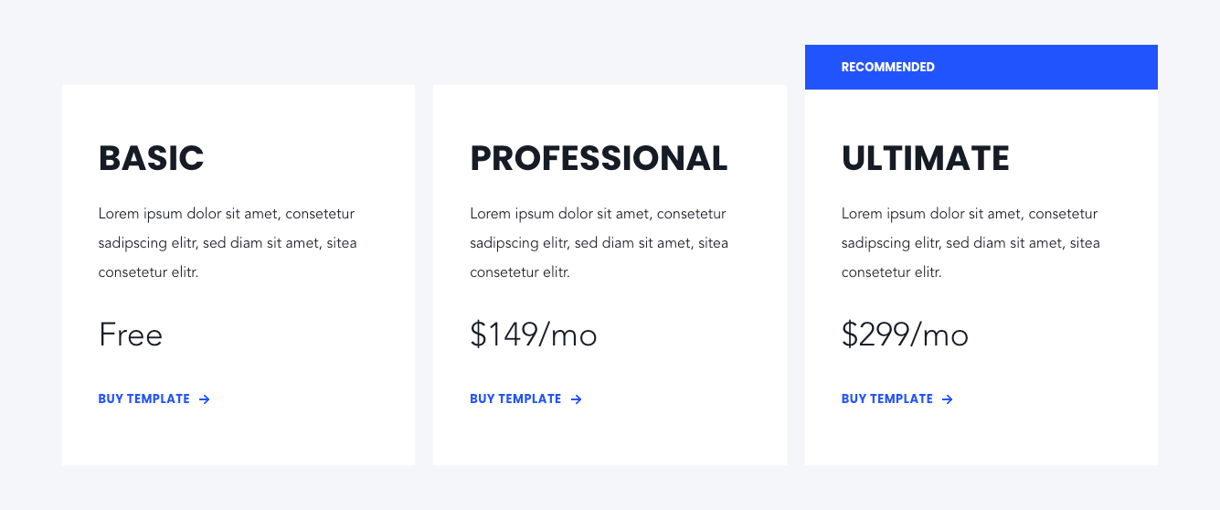
Layout: Defines the layout of the pricing boxes.
Reduced: shows only the title, description, price and CTA
Full: shows the pricing boxes with all the pre-configured features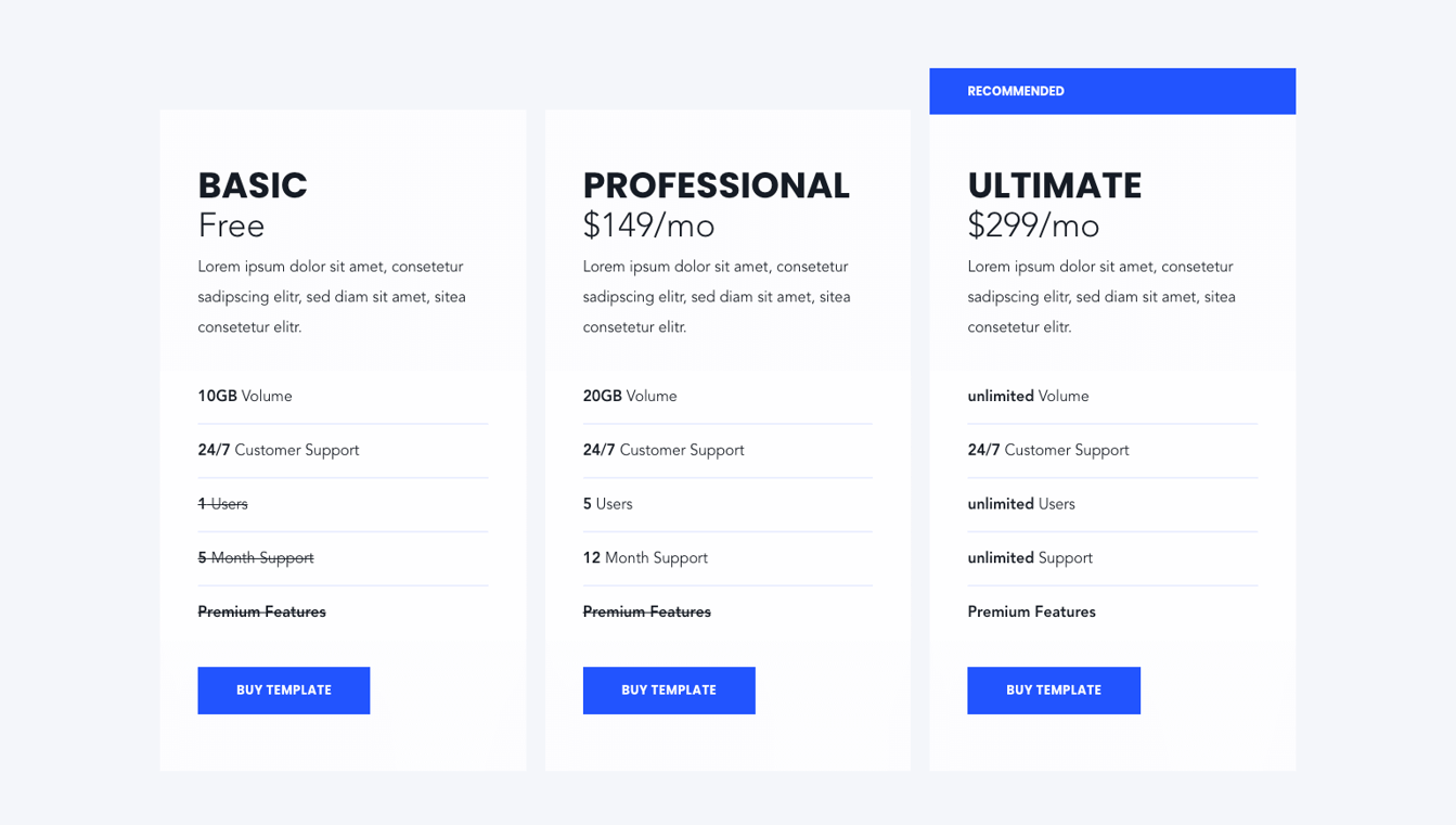
Table Style: Defines different table styles for the “Full” layout version
Style 1:
Style 2: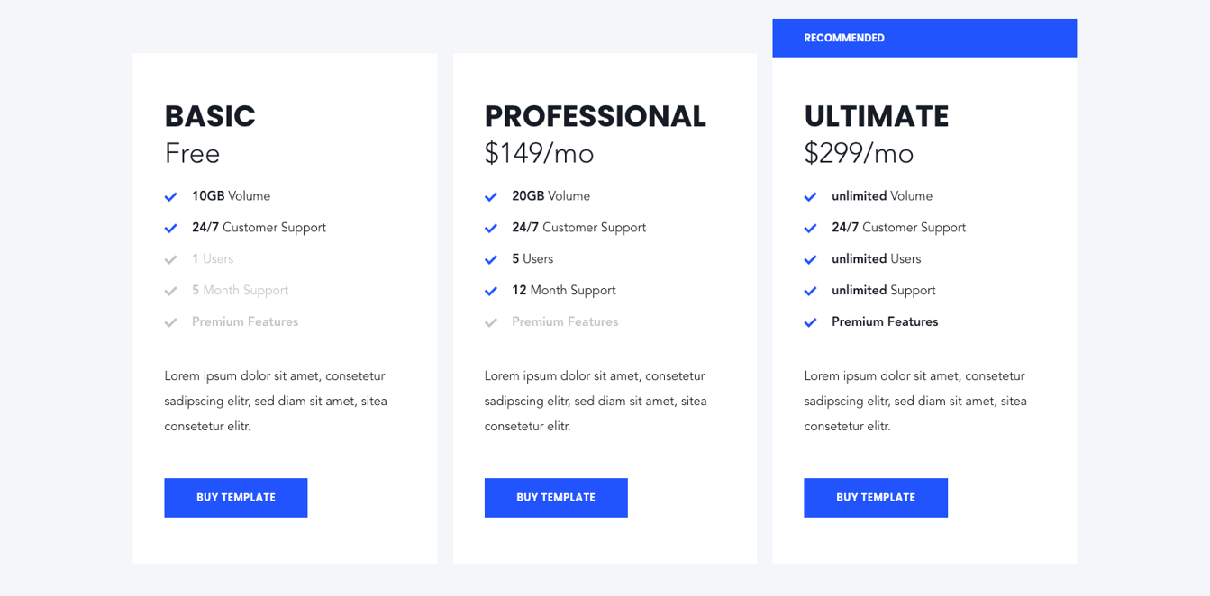
Of course, there is also a dark version: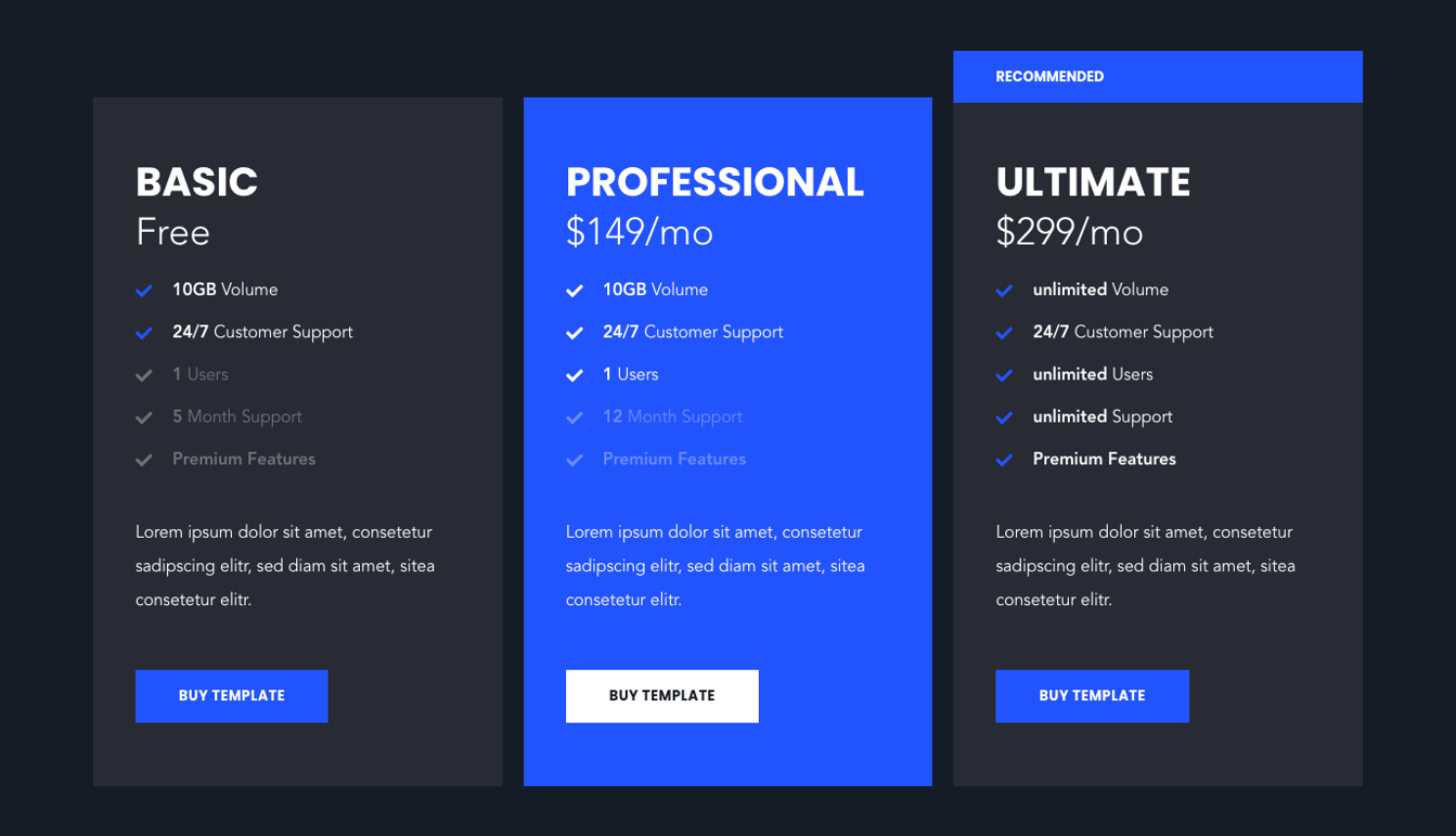
Combinations with background images and videos are also possible, as in almost every module.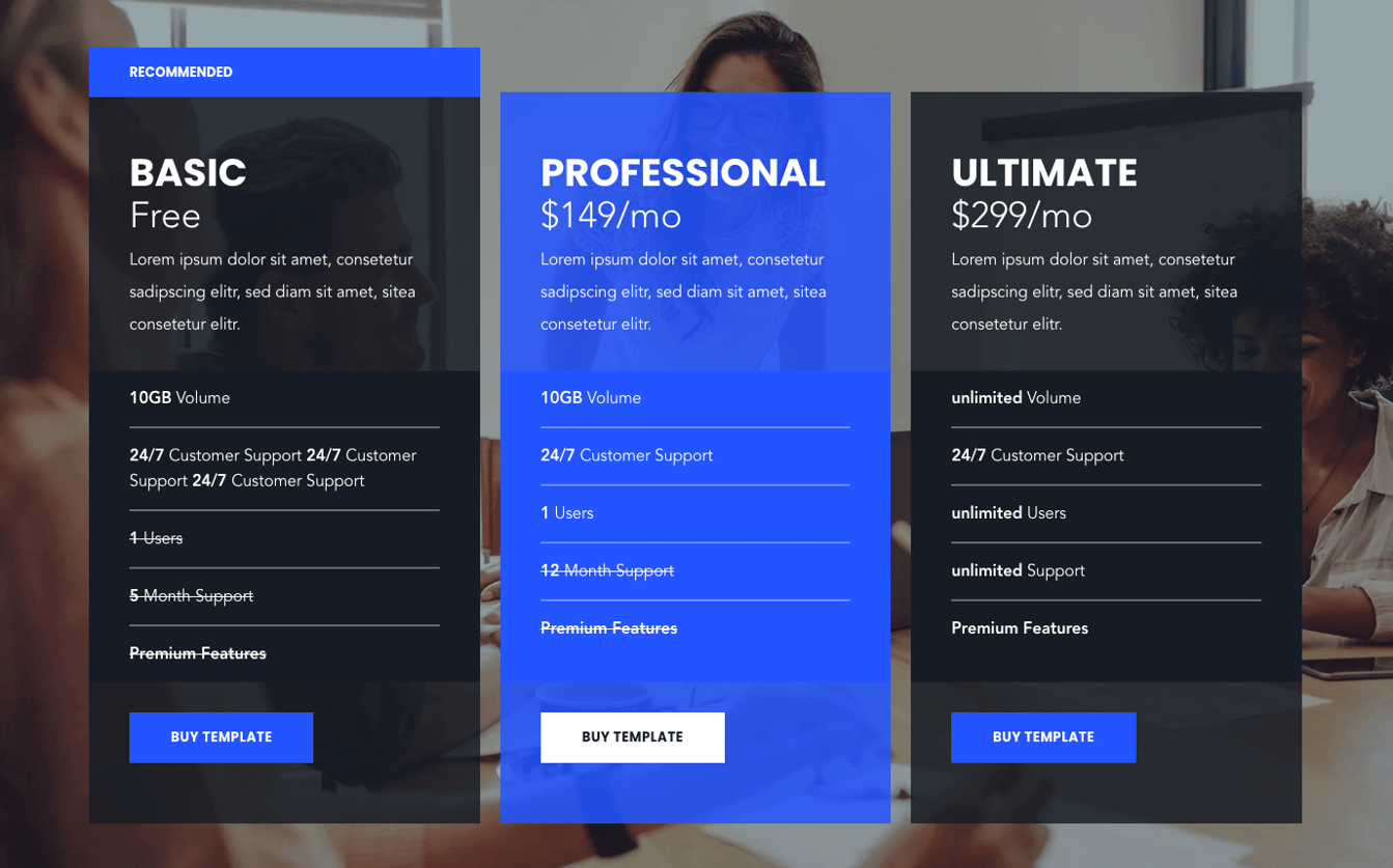
Section Schedule
This module offers a visualization of a time schedule. One can create daily schedules for multiple days, implemented as tabs.
If you want to use more than one daily schedule, make sure to activate the “Use Tabs?” switch before.
Tab: Create one set for each day.
Each configured set offers the following options: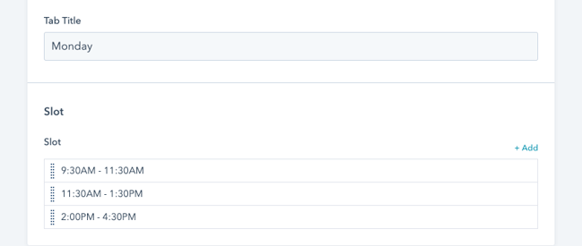
Each event has a deeper set which can be configured as: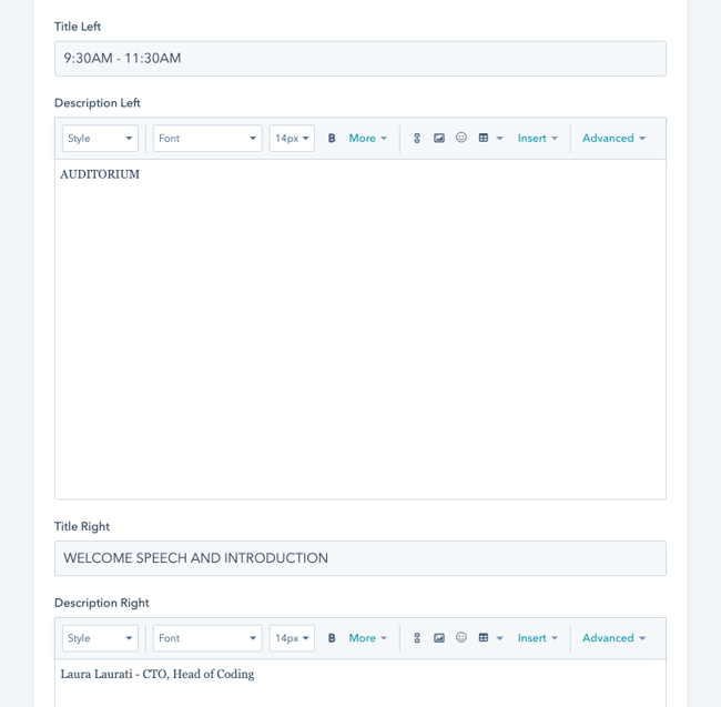
Dark version of the schedule module.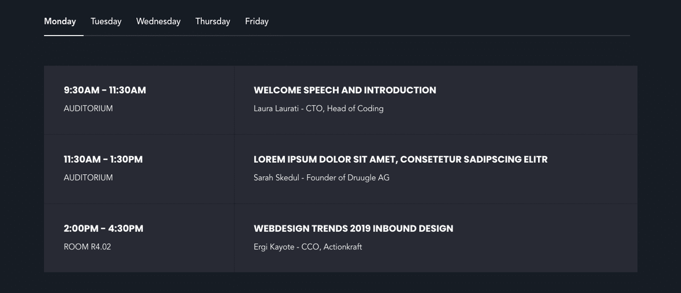
Section Services
This module visualizes services in 4 different layout options. Firstly, all services need to be defined here: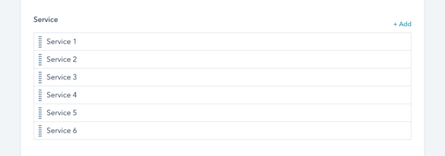
You can configure each service with the following options.
1. Icon: Choose an icon from the predefined list of icons
2. Or upload a custom image instead:
3. Title + description:
4. Link: If needed, you can link each service to another content page, external page, files, email addresses or blogs/blog posts.
Layout: We have provided multiple layout options for this module
1. Icon Top + Border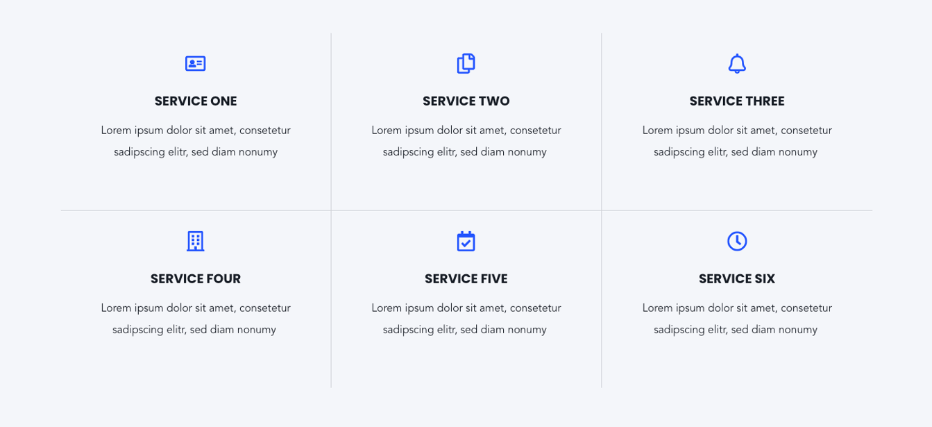
2. Icon Left
3. Boxed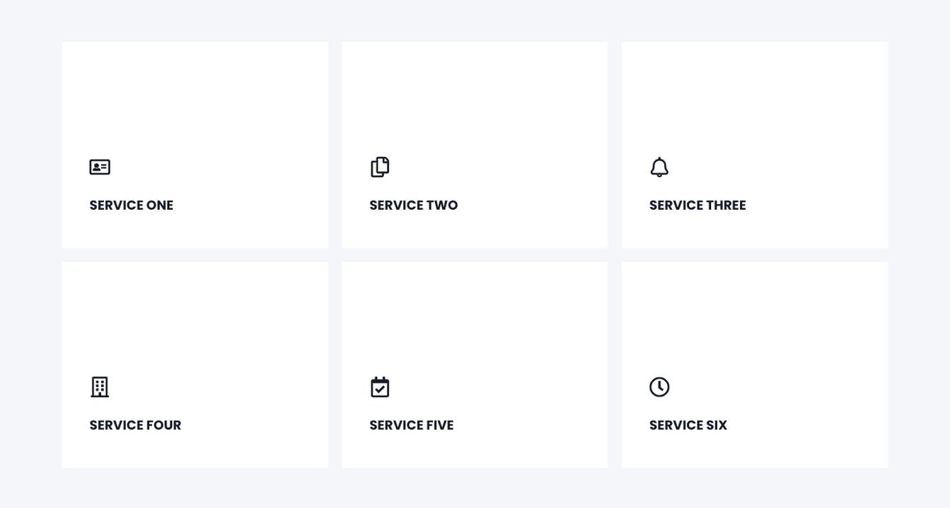
Section Team
This module is used to show the team members of your company.
Each team member can be linked to a team-member page, which we also provided in this template.
The following options can be configured:
1. Team: The information for each team member is stored in these elements.
IMPORTANT: If you would like to use tabs, make sure to activate the tab-layout BEFORE creating the team members.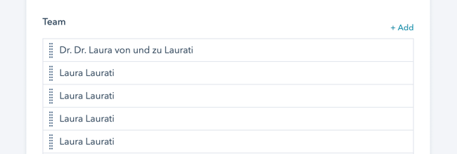
Each element contains the following options:
1. Name
2. Image
3. Title
4. Description
5. Contact: Activating this option, shows a variety of contact information for the “full”-layout version.
6. Link
2. Layout – Tabs: Activating this option enables a tab-system, where the team members can be nested additionally. The title of each tab can be defined individually in the tab-section:
3. Layout: We have provided the following 2 layout-options
1. Full (Tabs or without tabs)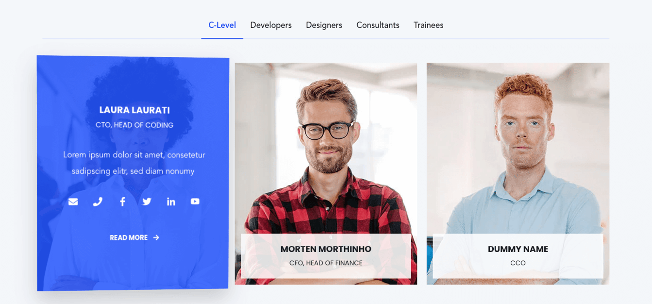
2. Reduced (Tabs or without tabs)
Layout Options: Enabling the option "show more" under your layout options for this module will allow you to hide your content behind a "show more" button depending on the size of your content.
Within these options the "collapsed height" is the height of your module that you wish to set as the initially displayed section of your content. Any content that is above this collapsed height will be hidden initially behind your "show more" button. Within here you can set the initial height for your content within Desktop, Tablet and Mobile screen widths.
You can also customise your button style based on the standard theme button styles, or use any of your custom button styles.
Section Testimonials
For customer testimonials, we have provided multiple layouts.
The following options can be configured in the testimonial module:
1. Testimonial: All content/information for the testimonials are stored in this sub-elements
Each sub-elements contains the following options:
1. Name
2. Job-Title
3. Image: Can be used for portrait photos of the quoted person or company logo
4. Quote
2. Autoplay: Automatically rotate through the testimonial slider after the defined autoplay interval time
3. Arrows: Turns on navigation arrows of the testimonial slider
4. Bullets: Shows bullets below the testimonial slider as an additional navigation aid
5. Layout: We offer the following 5 layouts:
One by One – Style 1
One by One – Style 2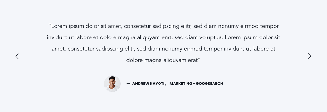
Multiple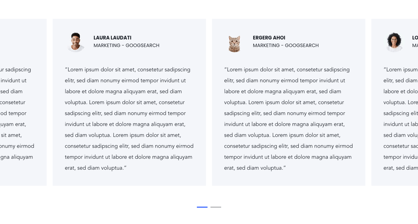
2 Column Listing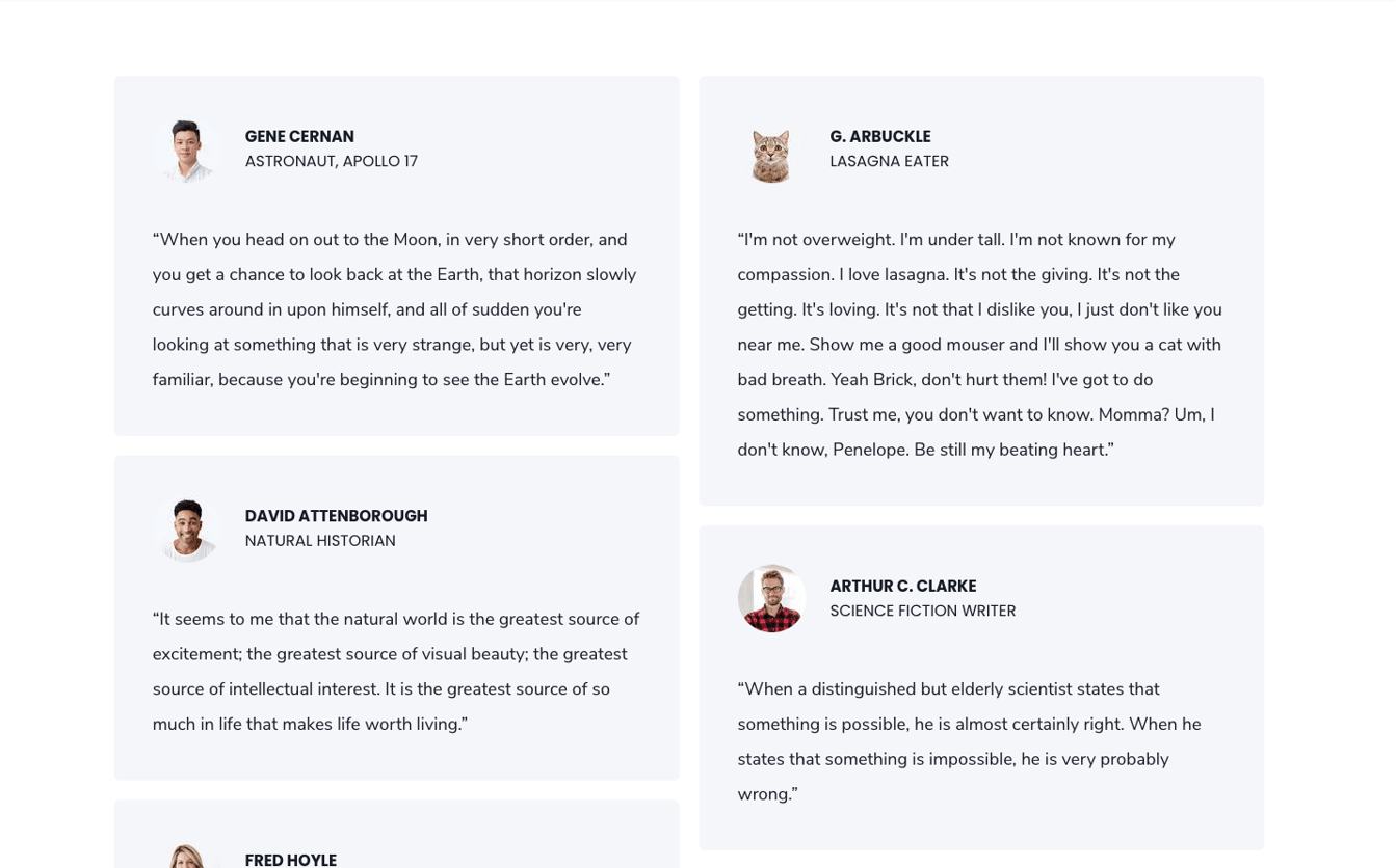
3-Column Layout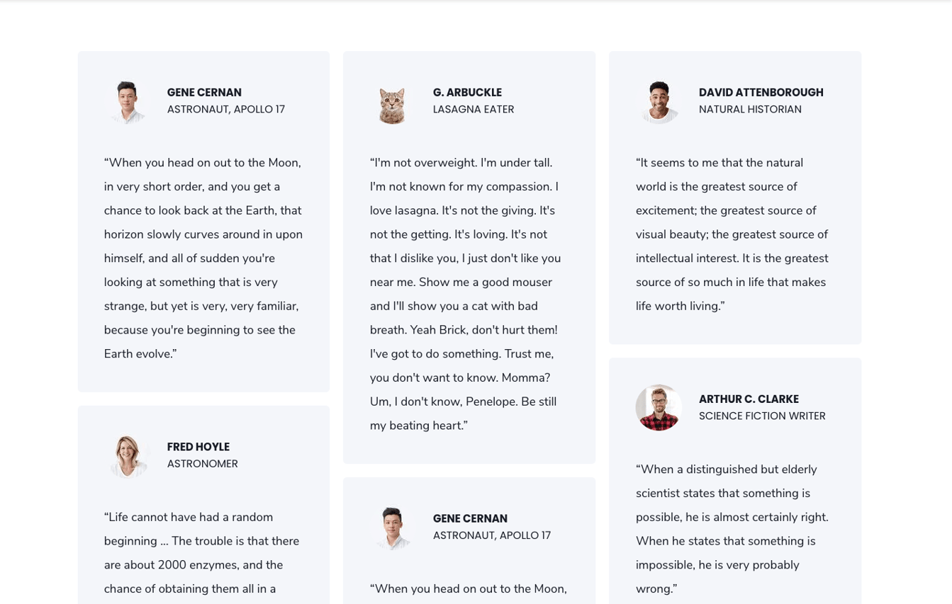
Layout Options: Enabling the option "show more" under your layout options for this module will allow you to hide your content behind a "show more" button depending on the size of your content.
Within these options the "collapsed height" is the height of your module that you wish to set as the initially displayed section of your content. Any content that is above this collapsed height will be hidden initially behind your "show more" button. Within here you can set the initial height for your content within Desktop, Tablet and Mobile screen widths.
You can also customise your button style based on the standard theme button styles, or use any of your custom button styles.
Section Text
For basic text sections we have created this text module. The text module offers multiple layouts. Each paragraph text can be customized using the rich-text editor.
The following options can be configured in the module:
1. Title, Title Header Type and Content. “Content or Left Content” is used for 1 column layouts. For 2 column layouts it represents the left side. An additional rich-text field “Right Content” will be shown for 2 column layouts and the layout “Title Left, Text right”
2. Layouts: We have provided the following 6 layouts:
Title top, Text 1 column
Title top, Text 2 column
Title left, text right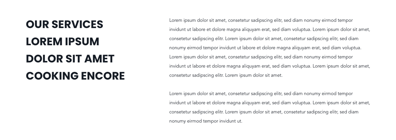
Text Tabs – Vertical centered
Text Tabs – Vertical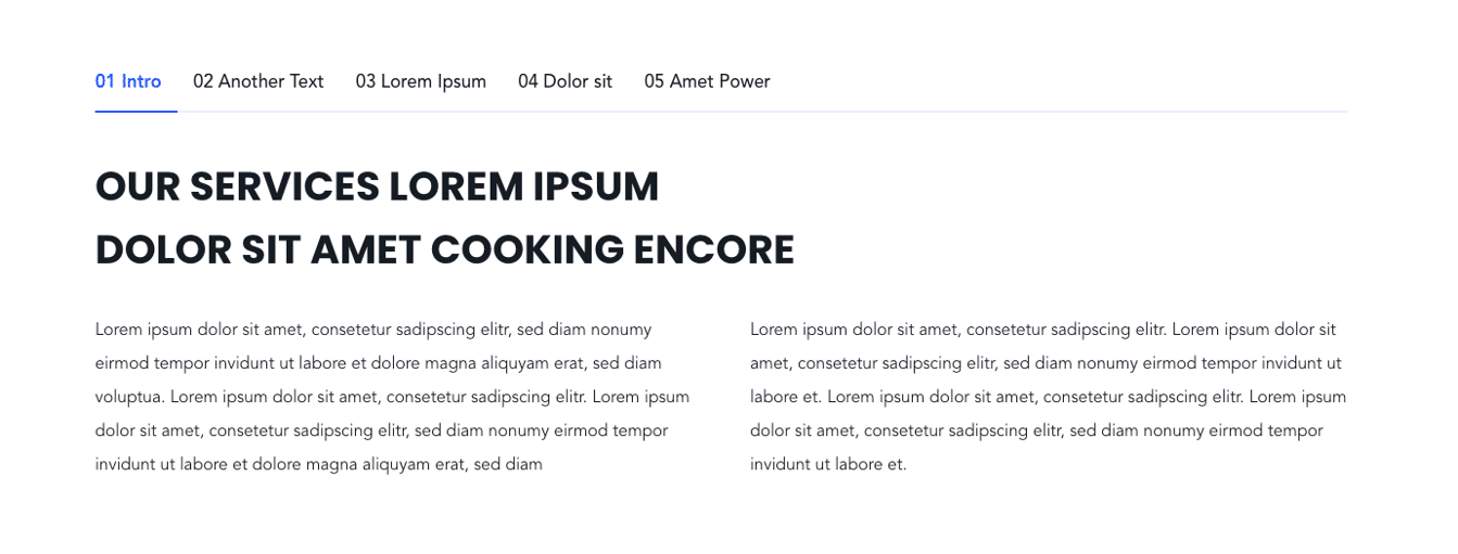
Text Tabs – Horizontal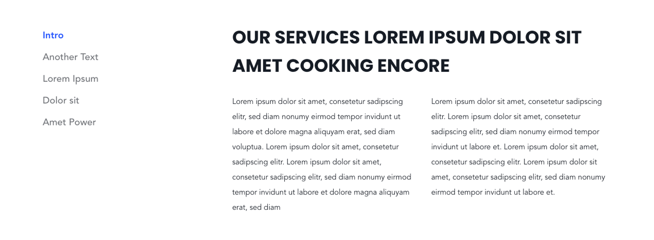
Layout Options: Enabling the option "show more" under your layout options for this module will allow you to hide your content behind a "show more" button depending on the size of your content.
Within these options the "collapsed height" is the height of your module that you wish to set as the initially displayed section of your content. Any content that is above this collapsed height will be hidden initially behind your "show more" button. Within here you can set the initial height for your content within Desktop, Tablet and Mobile screen widths.
You can also customise your button style based on the standard theme button styles, or use any of your custom button styles.
Text with TOC / Pillar Page TOC
The Table-of-Content Element offers the possibility to have a floated overview on the side of the website or an overview above the content. The contents of the TOC are pulled automatically from the page/module content.
This element is used in two different modules:
1. “Pillar Page TOC”: This module was designed for the usage on pillar pages. The whole content of the pillar page is covered if this module is included on the page somewhere.
Here, one has two options:
Positioning the TOC above the content
… or fixed at the side of the webpage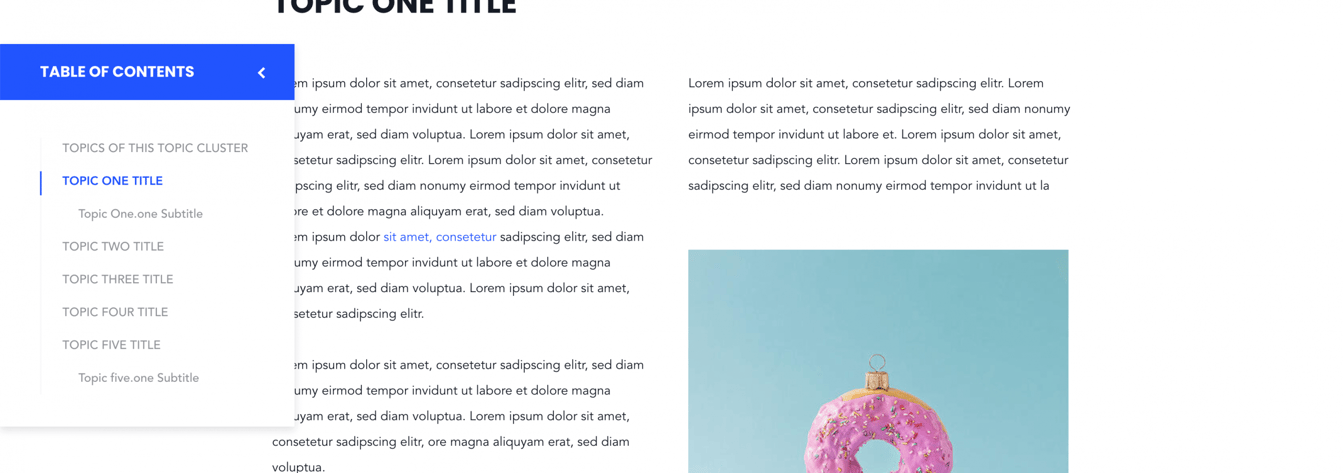
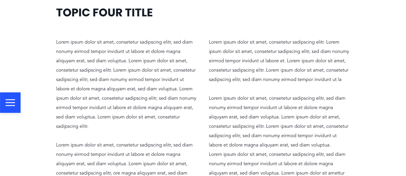
2. “Text with TOC”: Only the content created within this module is covered in the table-of-content.
Note that either module can only be used once per template / webpage.
Section Video
This module offers different ways to visualize videos on your website.
There are two ways to configure your video:
1. For self-hosted videos, select your *.mp4 video via the file manager of HubSpot.
Please make sure that the file size is not too big. A general rule of thumb is to keep reducing the file size until it starts to noticeably be degraded. Try to export videos in 720p and with a bitrate under 700kb/s ( preferably 500kb/s ).
2. If you would like to embed your video via YouTube, use the YouTube link or ID. The YouTube video will overwrite a configured self-hosted video.
If the user clicks on the title or button, the configured video opens in a light box. Of course you can configure an additional muted video in the background like in all of our section modules.
Other than that, the following options can be configured:
1. Layout: We have provided 3 different layouts for the video section:
1. Video Title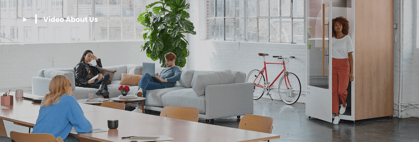
2. Button only
3. Content: Video with text overlay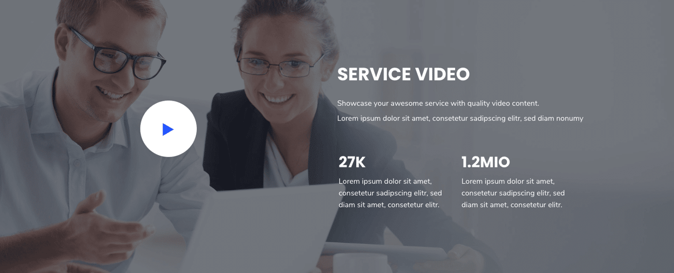
2. Section Height: Sets the height of the video section in pixels.
Section Video Boxes
The video boxes module provides a visualization for video libraries, webinar pages and sections.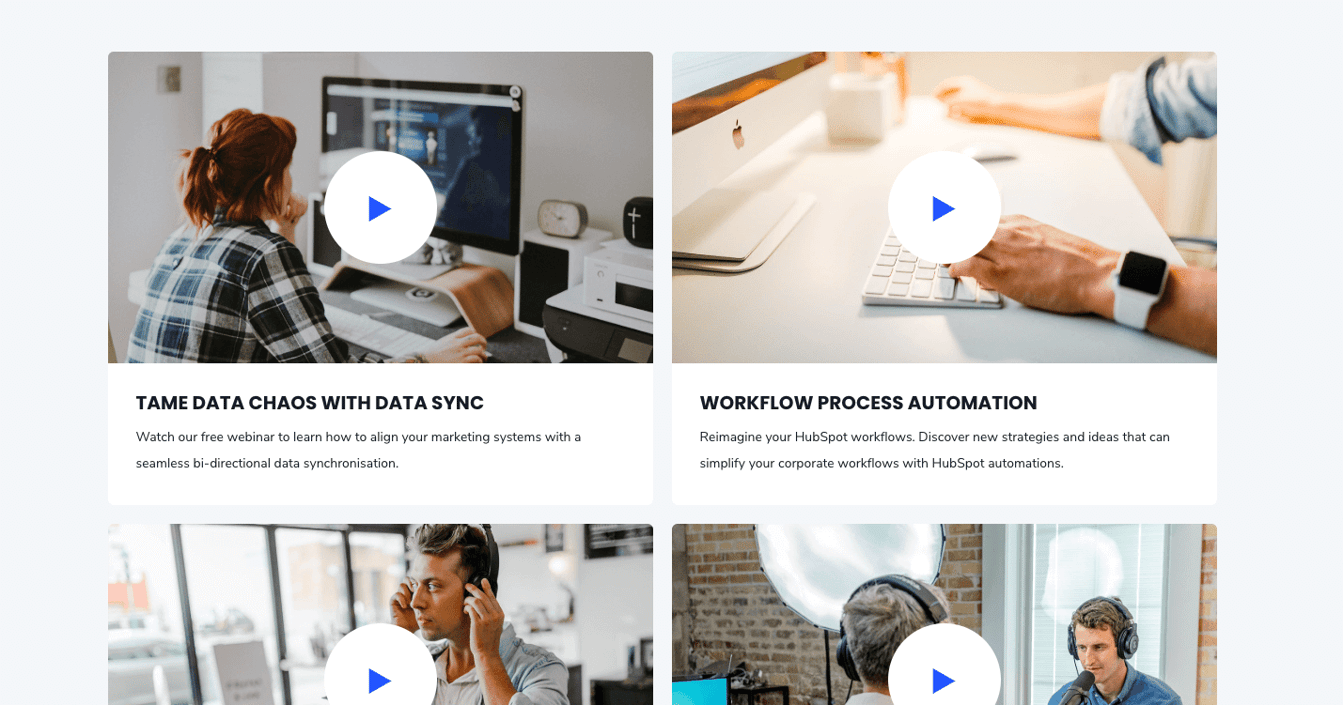
The following options can be configured in this module:
Video Box: All the necessary information for each webinar preview is stored in these sub-elements.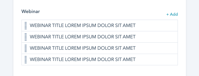
The following options can be configured here:
- Title
- Description
- Link
- Image
Filtering: Comma separated categories can be configured for each webinar. If webinars shall be grouped in the same category, make sure to specify the same category names.
You can choose to show the category “All” and which category should be active on page load in the module settings.
Layout Options: Enabling the option "show more" under your layout options for this module will allow you to hide your content behind a "show more" button depending on the size of your content.
Within these options the "collapsed height" is the height of your module that you wish to set as the initially displayed section of your content. Any content that is above this collapsed height will be hidden initially behind your "show more" button. Within here you can set the initial height for your content within Desktop, Tablet and Mobile screen widths.
You can also customise your button style based on the standard theme button styles, or use any of your custom button styles.
Next Steps
Need to add a Custom Font for your brand? If not, and your site's primary language is not English, or you'll be creating pages in multiple languages, you'll want to review the Multi-language settings to ensure the language switcher functions properly. Otherwise, jump on over to learn about forms.
Next up:


_enhanced.jpg?width=300&name=pwr-entry__hero-bg-(1)_enhanced.jpg)


